Great interfaces are made of good typography
Quick summary In this article, I explain principles of typography to master in order to design digital interfaces which communicate effectively with good working typography.
Digital interfaces make a huge impact in our lives. We frequently use websites or digital applications to accomplish certain goals. Indeed, when interacting with an interface, we are surrounded by typography and our experience is driven by the words and messages we read and understand.
In one of his articles, Oliver Reichenstein confirms the importance of typography in all websites with the following statement:
Web Design is 95% Typography.
Over the last couple of years, I decided to learn how typography works, since it’s one of the most important assets we have as designers to communicate clear and efficient messages, engage people emotionally and convey the appropriate brand’s characteristics into the interfaces we design.
Unfortunately, I noticed that several websites display disjointed looks and emotions since many designers and developers ignore the importance of typography.
Consequently, those websites communicate ineffectively and affect the user experience and brand perception.
The purpose of this article is to help designers and developers to understand how to work with typefaces, in order to create great interfaces.
Typography, brand and users
When a user interacts with an interface he also interacts and connects with the brand. To optimise the user experience, typefaces have to be consistent with the website brand’s tone and voice. In my opinion, MailChimp is one of the best examples which illustrates this concept. They have done this remarkably on their website by choosing for their headlines, the typeface called “Cooper light”.
This typeface has some personality and conveys a friendly and approachable style claimed by the brand.

As people don’t come to a website to enjoy the design but to read the content, it is important when choosing a typeface to understand how we want them to feel while reading it. For example, do we want them to feel relaxed, happy or agitated? This should be aligned with the brand attributes and art direction of the website.
The takeaway here is that anytime you choose a typeface, start by making a list of words which reminds your brand tone and voice. This will help you describe the feelings and moods you want to distillate with the fonts for the texts across your design.
By understanding the relationship between typography, users and the brand, you will be able to select the best typeface with confidence which will help your design achieve its goal.
Choosing the right typeface
To choose the right typeface, it is fundamental to consider the context of use and the purpose of a font in the interface.
You should always ask yourself:
Is the font I am choosing going to be applied to headlines, body copy, links, call-to-actions or navigation? These questions will help you to apply correctly the typeface to your design.
Choosing the right typeface also means taking into consideration a set of fonts optimised for extended texts, since for users, reading on screen may become tiring at some point, especially if the website is content-heavy.
To search for typefaces, I usually like to explore fonts in Google Font or Adobe Fonts (Typekit).
They both provide a selection of high-quality typefaces optimised for the web. I avoid using any typeface coming from free websites or unknown resources, as often they don’t provide great and well-tested typefaces.
Also, as a rule of thumb, it’s recommended to choose two typefaces maximum in order to keep the design of an interface consistent.
When working with typography for the web, there are two main principles you must know as a designer to make the content accessible and legible: Readability and Legibility.
Legibility
Legibility is the ability of the reader to distinguish letterforms when reading. Here are the factors which contribute to a typeface's legibility:
Display typefaces
We call “display typefaces” the ones designed to be used at large size. Those are perfect for headlines as they are clear, noticeable and they stand out. However, these typefaces are less readable at smaller size and shouldn’t be used for body copy. One of my favorite typeface for headings is “BEBAS NEUE”.

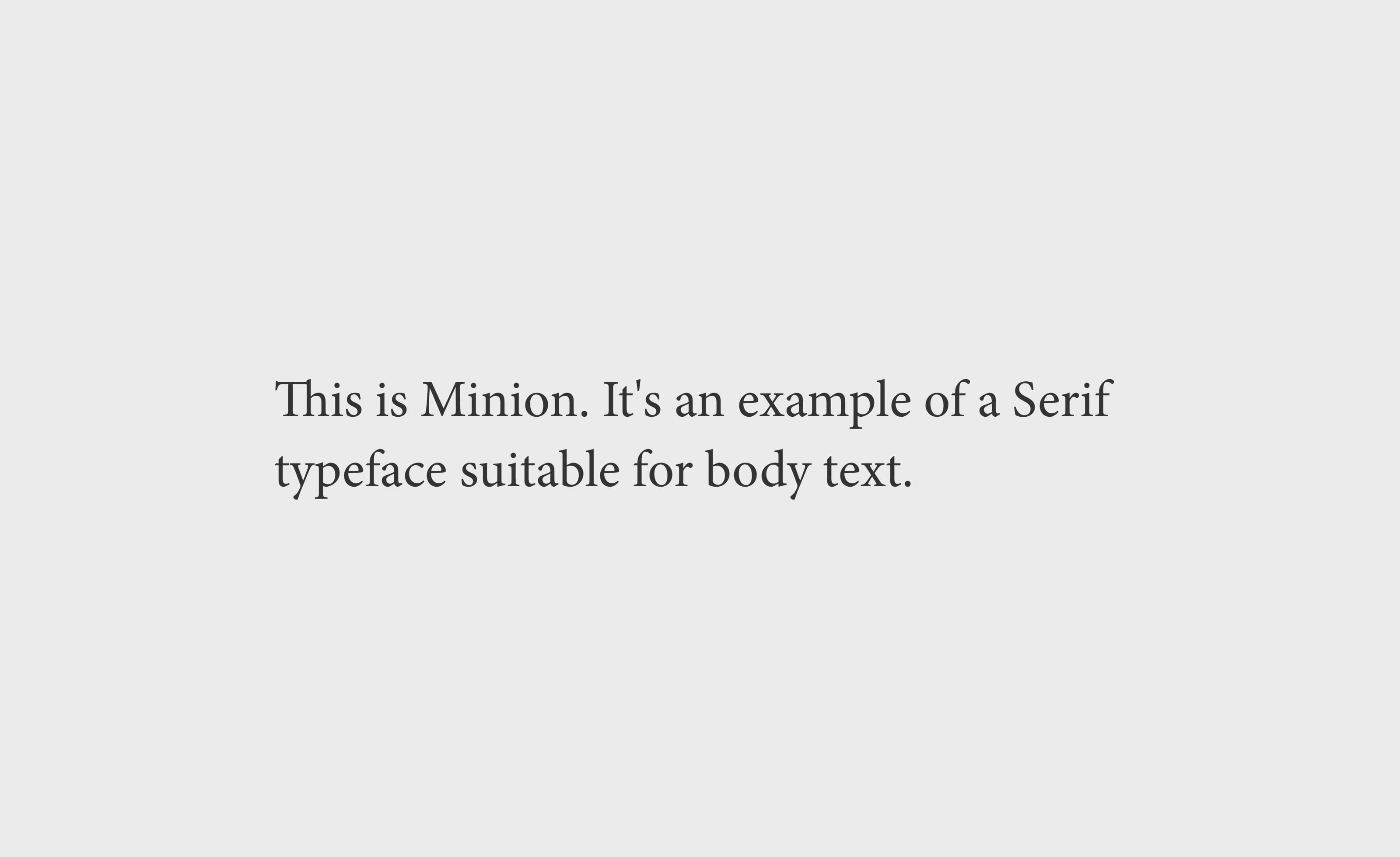
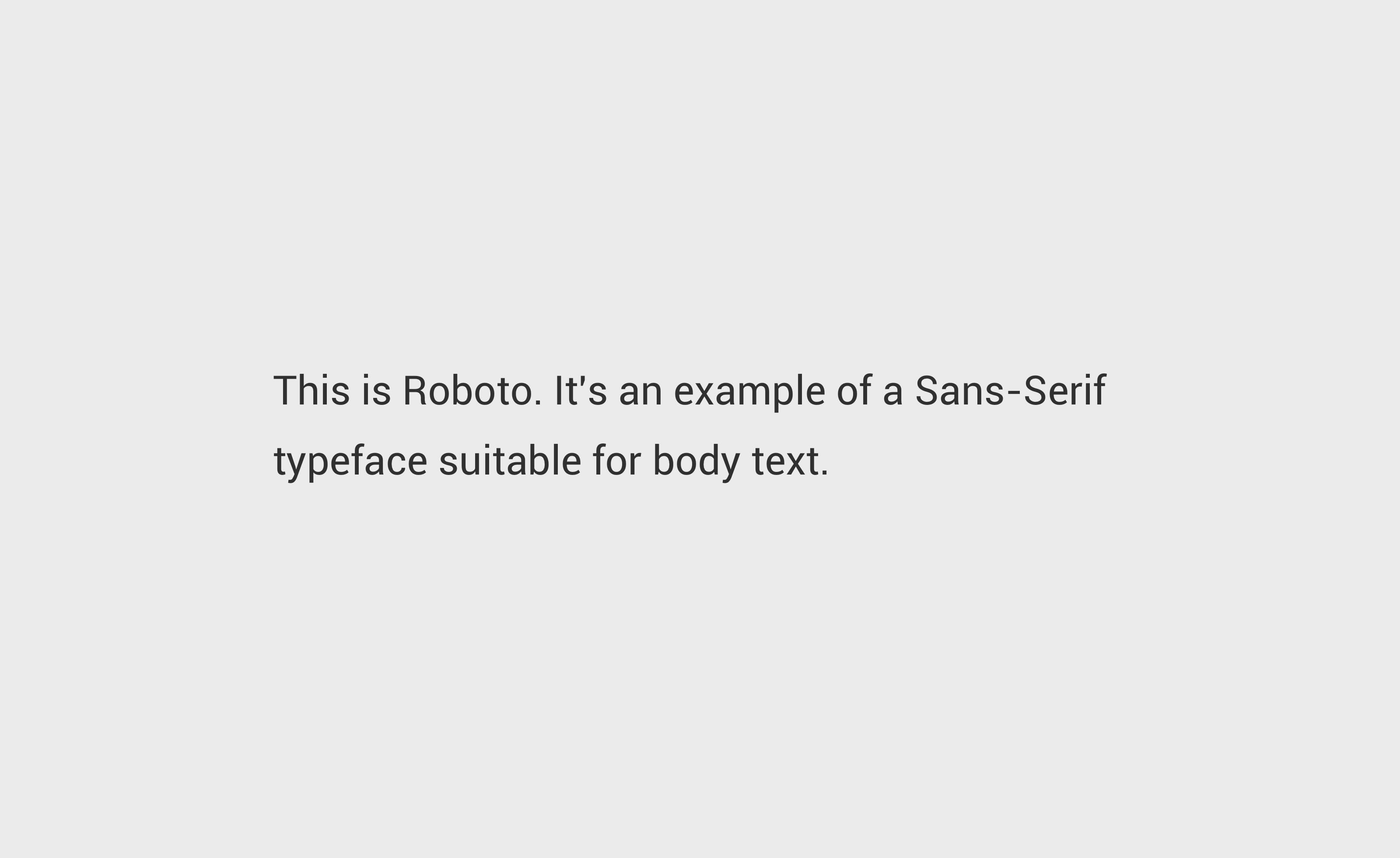
Serif and Sans Serif typefaces
On the web, there are mainly two groups of typefaces we work with, Serif and Sans Serif. Traditionally, Serif typefaces have always been more legible and are often used in print for long passages of text. As the web and design trends evolve, we can find more websites using Serif fonts for some body copy. When well chosen this works well.
However, Sans-serif fonts are more commonly used for body text due to their simple letterforms. It’s great to choose fonts with a slight “touch of personality”, but not decorative as it can increase the cognitive load of the users and affect their reading experience.
Based on my experience with typefaces, I prefer to use Sans-serif fonts for body text and Serif font for titles, if it’s necessary. At the end, try some combinations and judge what works and feels the best for your design.
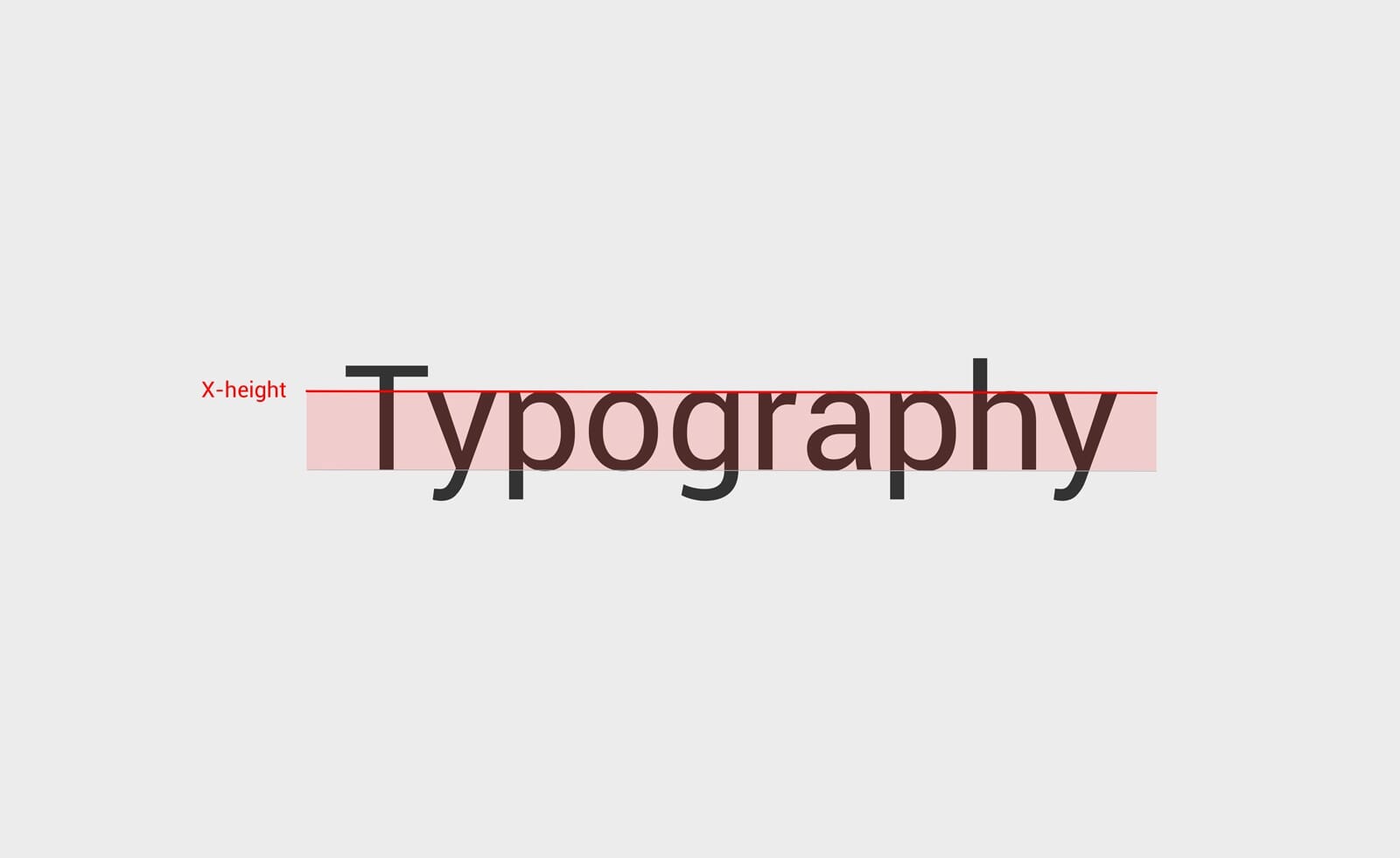
X-height
The X-height is an important characteristic to take into account when evaluating a font. The fonts which work the best for body copy are the ones with a larger x-height. The taller the x-height, the more legible the typeface tends to be. It is an important rule to remember when choosing fonts for body text.
Readability
Just because a font is legible doesn’t mean it’s readable.
In fact, readability is the level of comprehension and visual comfort when someone reads a text. If you find yourself stopping to admire a font instead of reading the text, chances are that the font is not readable.
Here are two examples to visualise the explanations above:
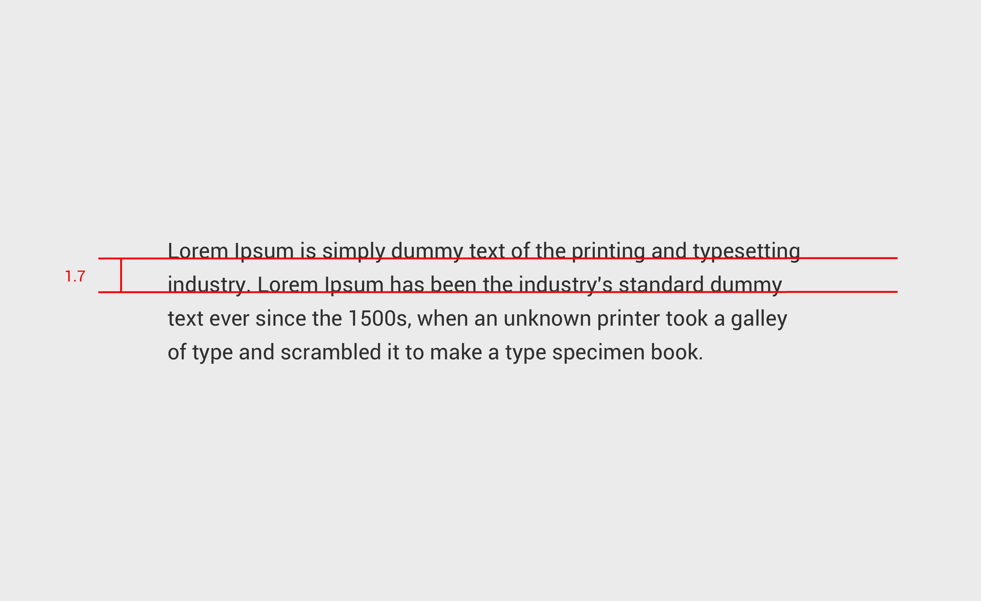
Line height
Line height also known as leading defines the space between baselines in a block of text. A true ideal line-height doesn’t exist, because every typeface is different. However, a good starting point with line-height is between 1.2 and 1.8. Small line-height can make the text difficult to read as lines are close to each other. Generally speaking, if users have trouble reading the font applied to a text on a website, they will consider the item of it hard to read and understand.
Line spacing
Line spacing is the space between paragraphs. Always keep paragraph spacing in the range between .75x and 1.25x of the type size.
Size
Size matters when working with typefaces. We need to consider our content to be readable by people of all ages. For the size of the font it’s good to stay at 16px or 1em at smallest. The font should be large enough to be comfortably readable.
When browsing a website, people are busy and in a hurry, that is why it is important to make the content clear and fast to read.
Line length
Another common practice that improves readability is preventing horizontal lines of paragraphs to be too wide. Indeed if a line is too long, it stretches the user’s eye and causes fatigue. The rule of thumb here is to set the line length to 40 to 70 characters maximum.
Hierarchy and contrast
Good type contrast is essential for readability. This is an important principle to understand while creating good and consistent hierarchy on the website’s content. A successful hierarchy organises the content in digestible parts, easy to scan and accessible to the users.
Conclusion
In my experience, I have noticed that once you understand these principles and master typography for the web, your design will become stronger and more appealing as typography is content and content is UX.
It is mandatory to remember that you don’t design websites to be pretty, but to help users achieve a certain goal. Here are a few resources you can browse and explore, that helps me every day to improve my skills in typography:
Websites
Books
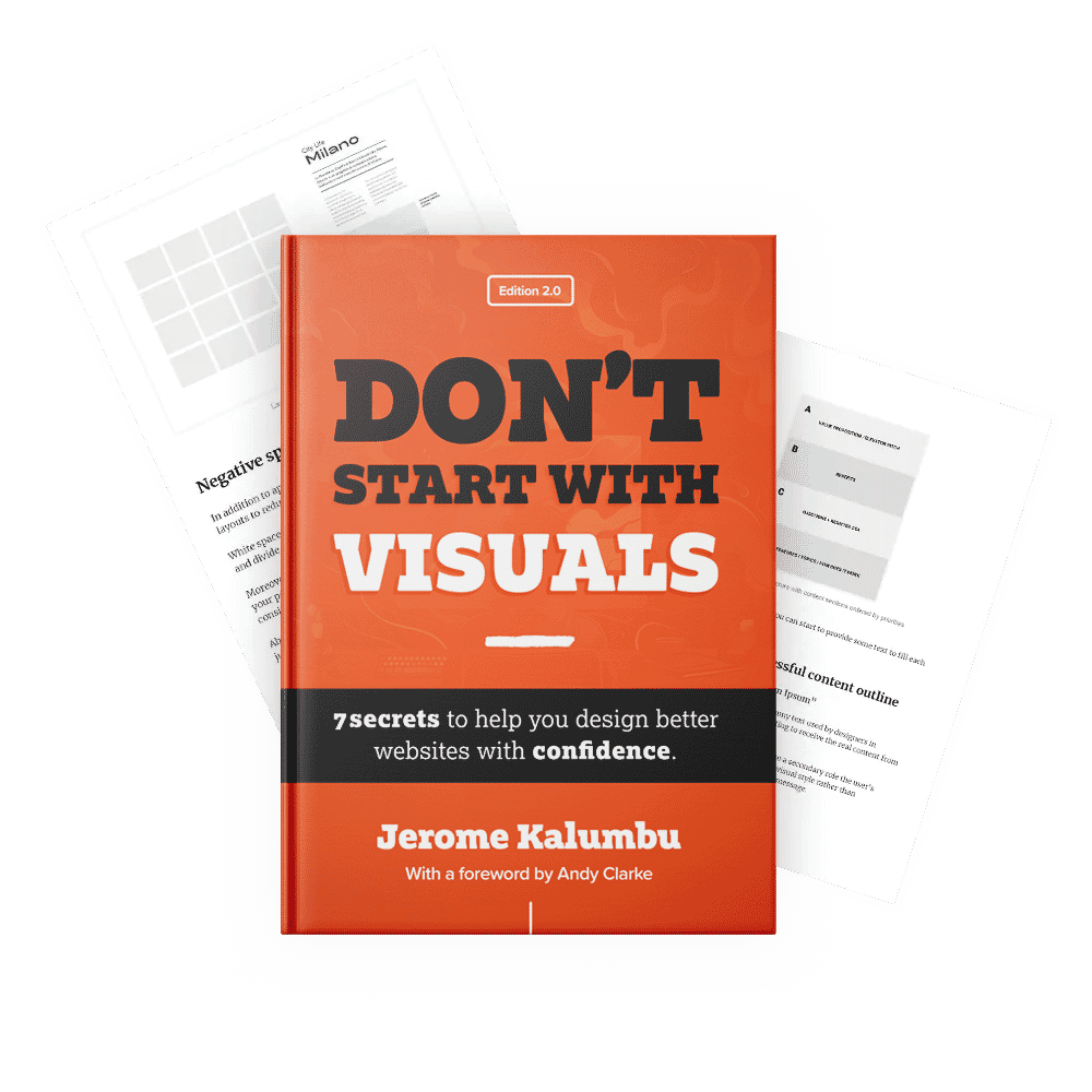
If you want to learn more about this topic, read my book “DON’T START WITH VISUALS”.