How to combine typefaces successfully to add personality to your digital interfaces
Quick summary Combining typefaces properly is tricky. In this article, I explain several approaches to make this process straightforward and add personality to your digital interfaces.
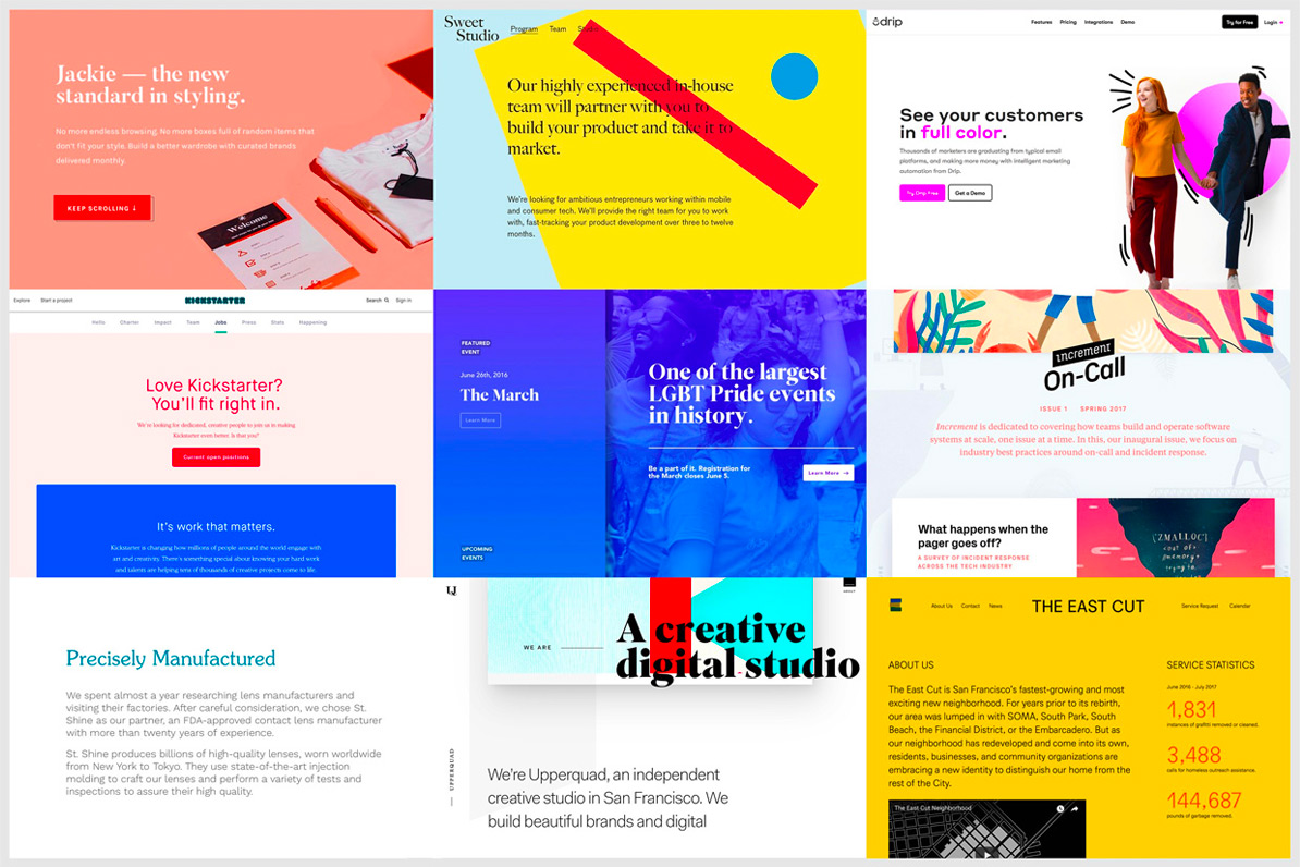
In my first article “ Great interfaces are made of good typography”, I explained some principles to master in order to create digital interfaces which communicate effectively with good working typography. In addition to that, my other article “How art direction will help you create masterful web interfaces” shed some light on how the choice of typefaces can influence the art-direction and the personality of a website and, therefore it’s brand.
In the present article, I will show you how to pair typefaces successfully in order to create a feel and add personality to your designs.
In fact, when combined properly, typefaces help to communicate a clear hierarchy as well as improving the reading experience of the user. Learning how to pair typefaces is the best way to add personality and create a design which feels right for the user on a website, app or system.
The purpose of this article is to help designers including anyone interested in typography to understand some techniques to use in order to combine different typefaces accurately and avoid any visual “cacophony” on their design.
Here is a brief guide with tips to remember when it comes to pairing typefaces.
The starting point
For any project you work on, you should always select your types wisely. Good pairing starts by knowing the kind of fonts you are looking for, and by defining the anchor typeface to find the best combination.
Know your typefaces
Generally, as typefaces have personalities and therefore different voices, it can be challenging to choose and combine them successfully to get the best combination of tone, texture and timbre.
In fact, on the 7 rules for great typography (Rules course available on Udemy), Joe Natoli recommends limiting the choice to two font families maximum to keep the design of a User Interface simple and consistent.
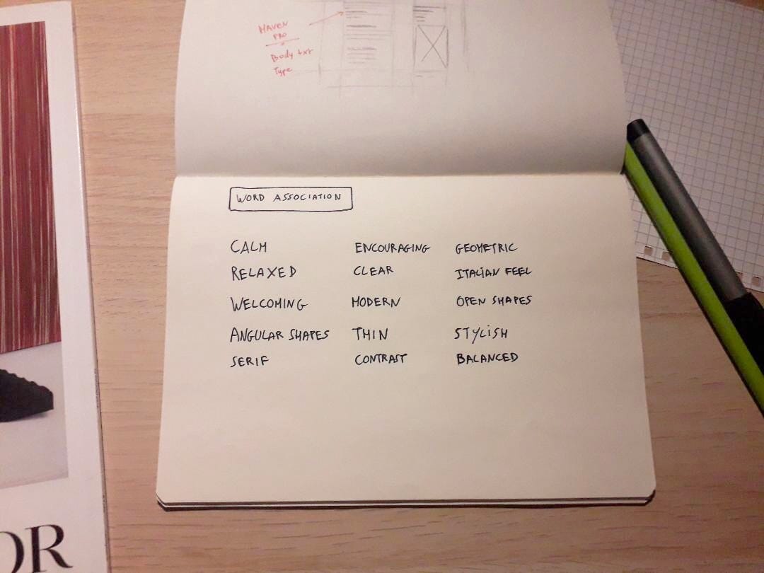
Moreover, understanding the writing goals and feelings of the content you typeset will help you to choose and combine typefaces correctly. When I work on a project, my favorite approach to find the typefaces is to use word association as a way of articulating the atmosphere and emotions I need to convey. In addition to that, I like to read about the history of the typefaces to understand their connotation and qualities in detail.
Define the anchor typeface
Once you have an idea of the typefaces you want to use start by defining the anchor typeface. This will be your reference point to work out the size, spacing, contrast and to find good matches. Usually, body text typeface makes the best anchor as it represents the majority of the text people will read on a website. Anchoring your choices to a single typeface can lead you toward good combinations.
Methodology for good type pairing
Once you have set the anchor type, you are now ready to combine it with an additional typeface. Here is a method for you to follow in order to realize a successful type pairing.
Compare the typeface's letterforms
Once you have defined the base typeface, analyze carefully its structure and characteristics. This will help you to find potential similarities when you compare the anchor with a typeface to pair with. For instance, compare their letterforms such as the counter, loop, shoulder, and serif.
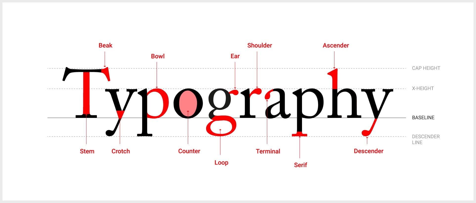
When I need to compare two typefaces for pairing, I often analyze their x-height first, then I look carefully at the shape of the characters g, o, e and a to understand both their foundation and common traits.
For example, the character “o” by itself can give you good information about the classification and stress of a given typeface.
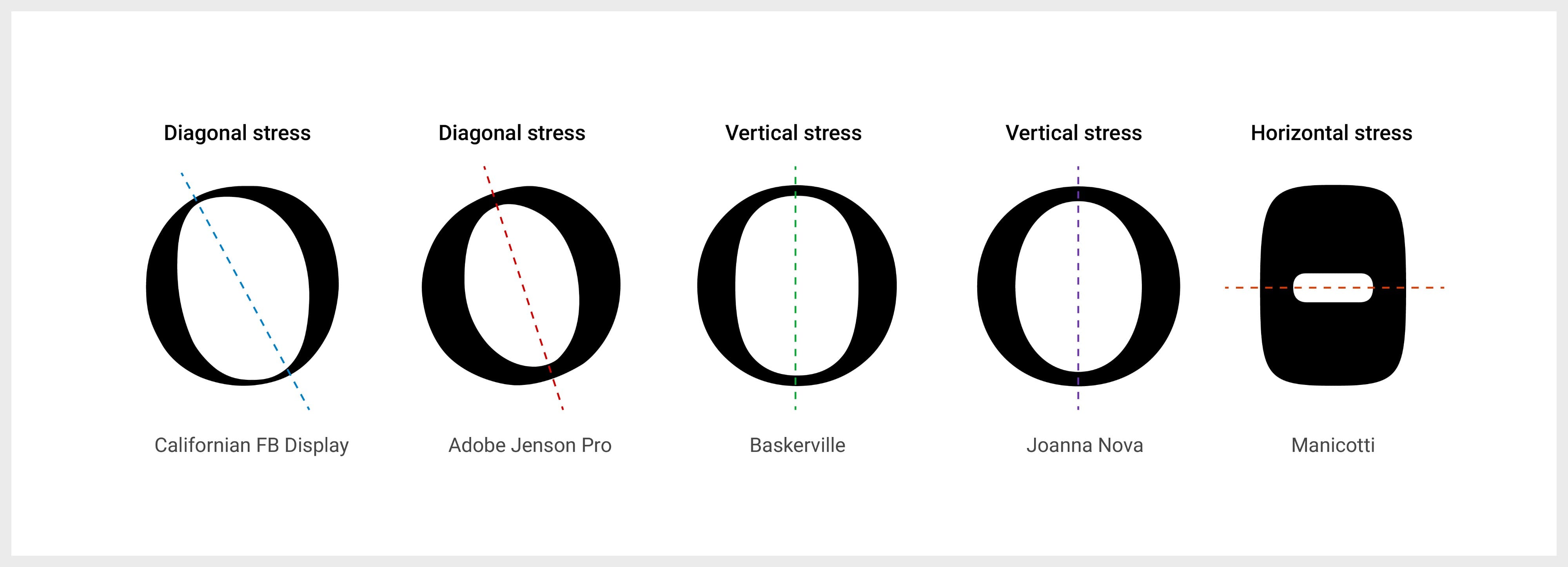
The key point to remember at the end, is that harmonious types have relationships in their structure and complementary forms which strengthen their connection.
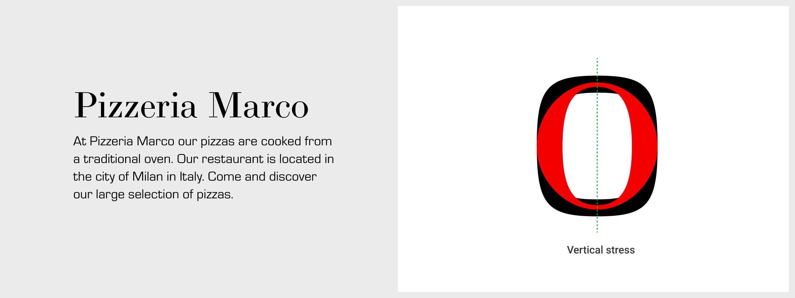
Bodoni and Eurostile typefaces
Bodoni and Eurostile are two different typefaces created by Italian typographers. They both work well together and here are the reasons: They share the same geometry and origin, even though they are separated by their period of creation. In fact, Bodoni was designed with a strict vertical stress giving it many symmetrical shapes that are echoed in the linear geometric form of Eurostile.
Always look for contrast and distinction
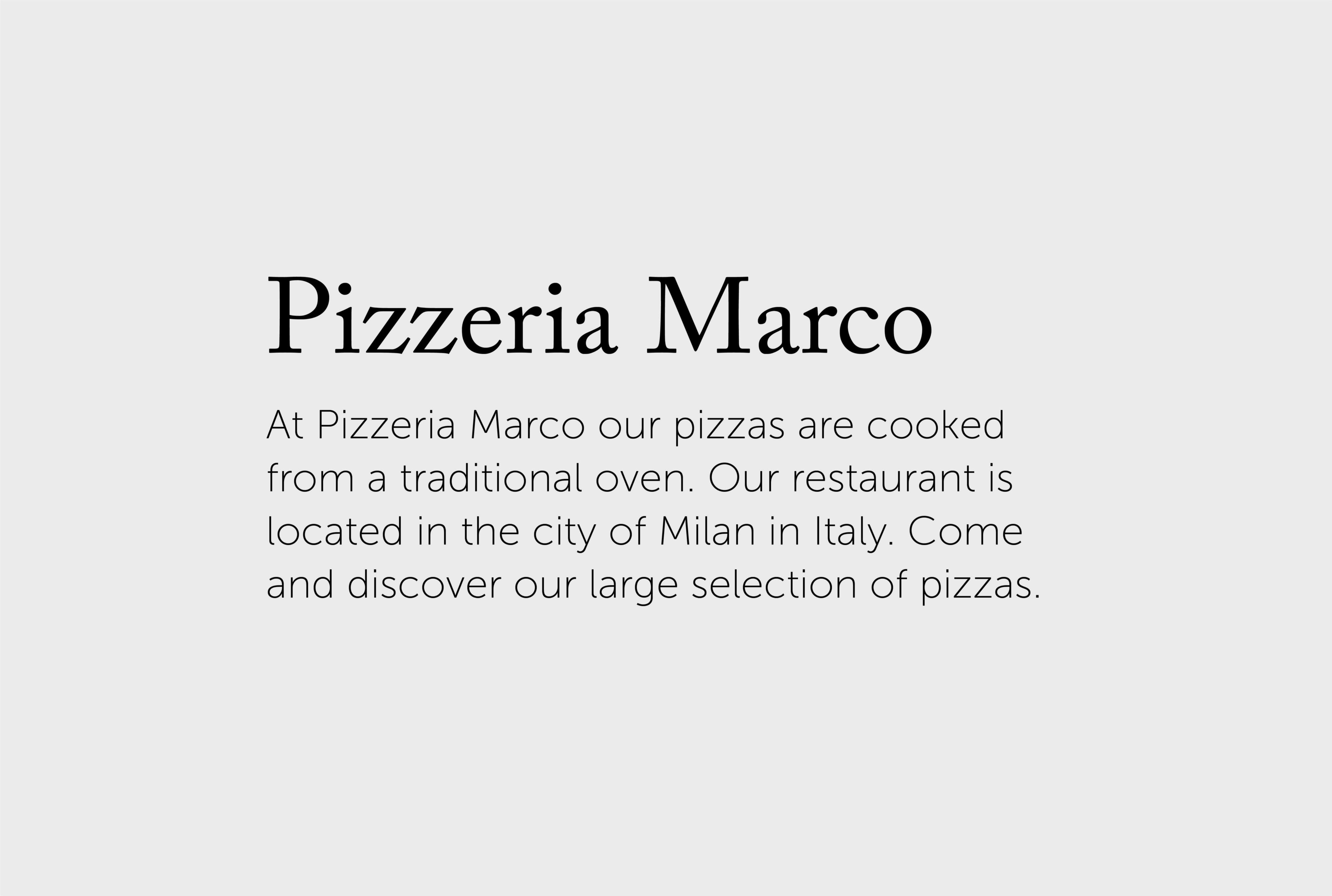
To make the content easy to scan and read, it is important to always choose two contrasting typefaces. Having a good contrast between two types will highlight the hierarchy of the content. Always look for distinction while paying attention to the common characteristics the typefaces could have between them.
In case you use a single typeface across your project, contrast can be achieved by using a relevant font style or weight from the family.
For example, Adobe Caslon and Museo Sans combine well together and have a good contrast between them:
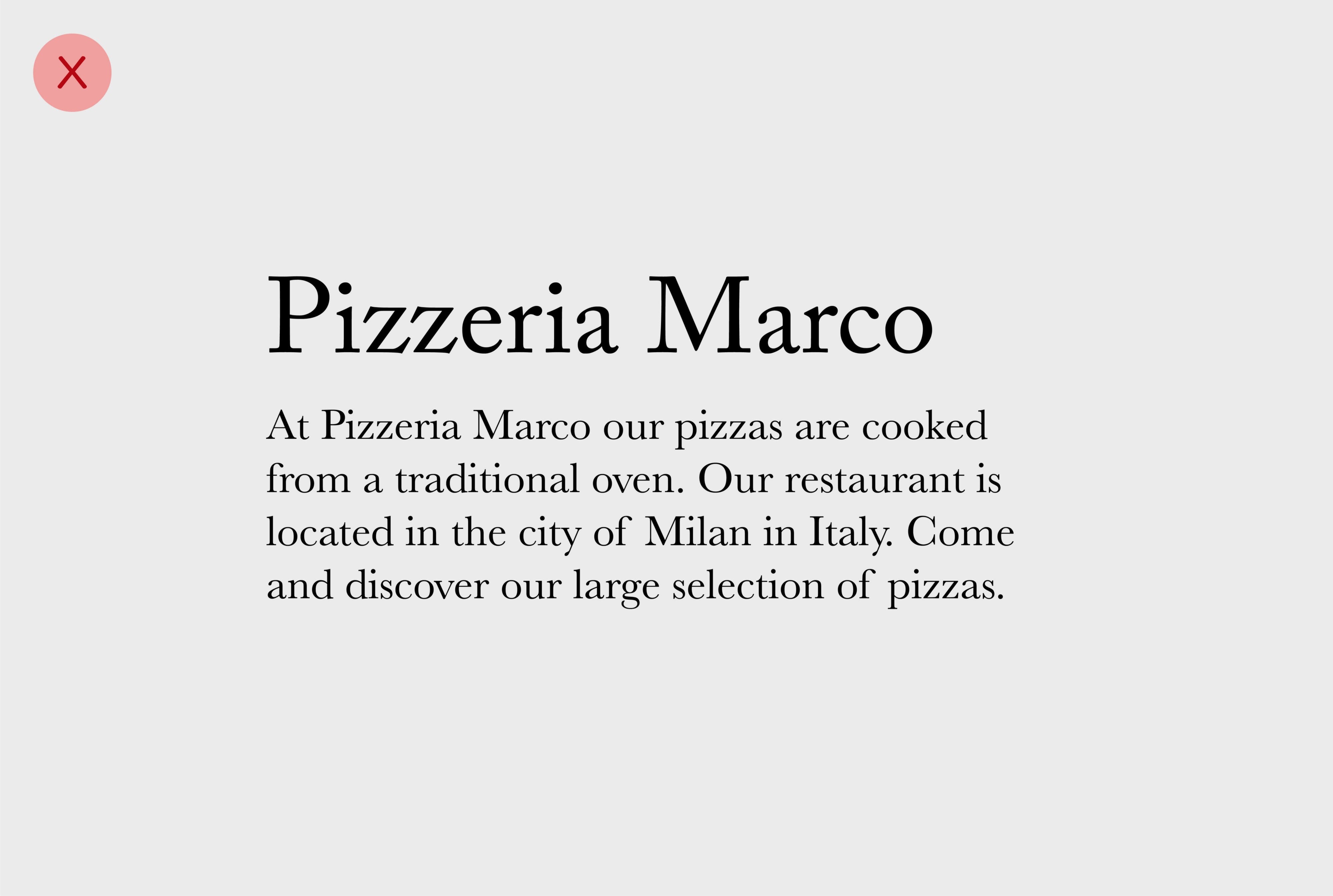
However, never combine two typefaces with strong resemblance between them. When they are too similar, they are indistinguishable.
Consider pairing Serif and Sans-serif types
In case you are in doubt when pairing two typefaces, you can always rely on this basic rule of thumb: Pairing one Serif with one Sans-serif typeface.
Generally, this combination works as it avoids wrong pairing. Although being straight forward, keep in mind that this combination is not necessarily the best.

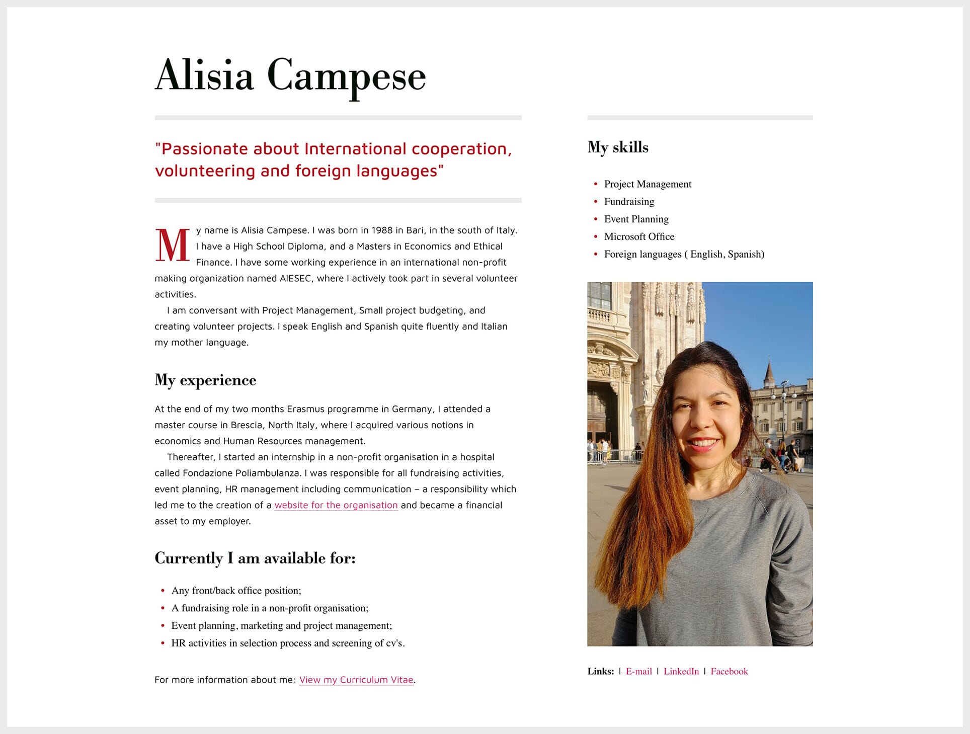
Below is a piece of content I art-directed pairing two different typefaces. I used the serif typeface “Bodoni” for the headlines and list items to give my design an Italian feel. I chose to use the sans-serif typeface “Maven Pro” for the body text to infuse a modern style to my layout. Even though they are different, both typefaces work well together. Furthermore, they are well distinguishable since they have enough contrast between them.
Combine fonts from the same family
If you begin to work with types and not yet familiar with how to pair typefaces, this is the safest approach to consider.
In fact, typefaces provide a collection of ready-made and matching fonts. This is the easiest way to look for pairing. You will just need to pay attention to contrast in order to make the hierarchy of your text distinguishable.
This is a rule of thumb when you start learning about typography. Always master one type and use the provided style and weight to arrange the hierarchy.
Pair typefaces from same author or origin
When you work with typefaces, it is important to know the history and origin of the types you are working with. This will also help you to understand more about their author.
Combining typefaces from the same author could be a good starting point as they often share the same style and structure defined by the author. This approach will help you to have good combinations most of the time. Note that pairing typefaces from the same foundry can also be relevant.
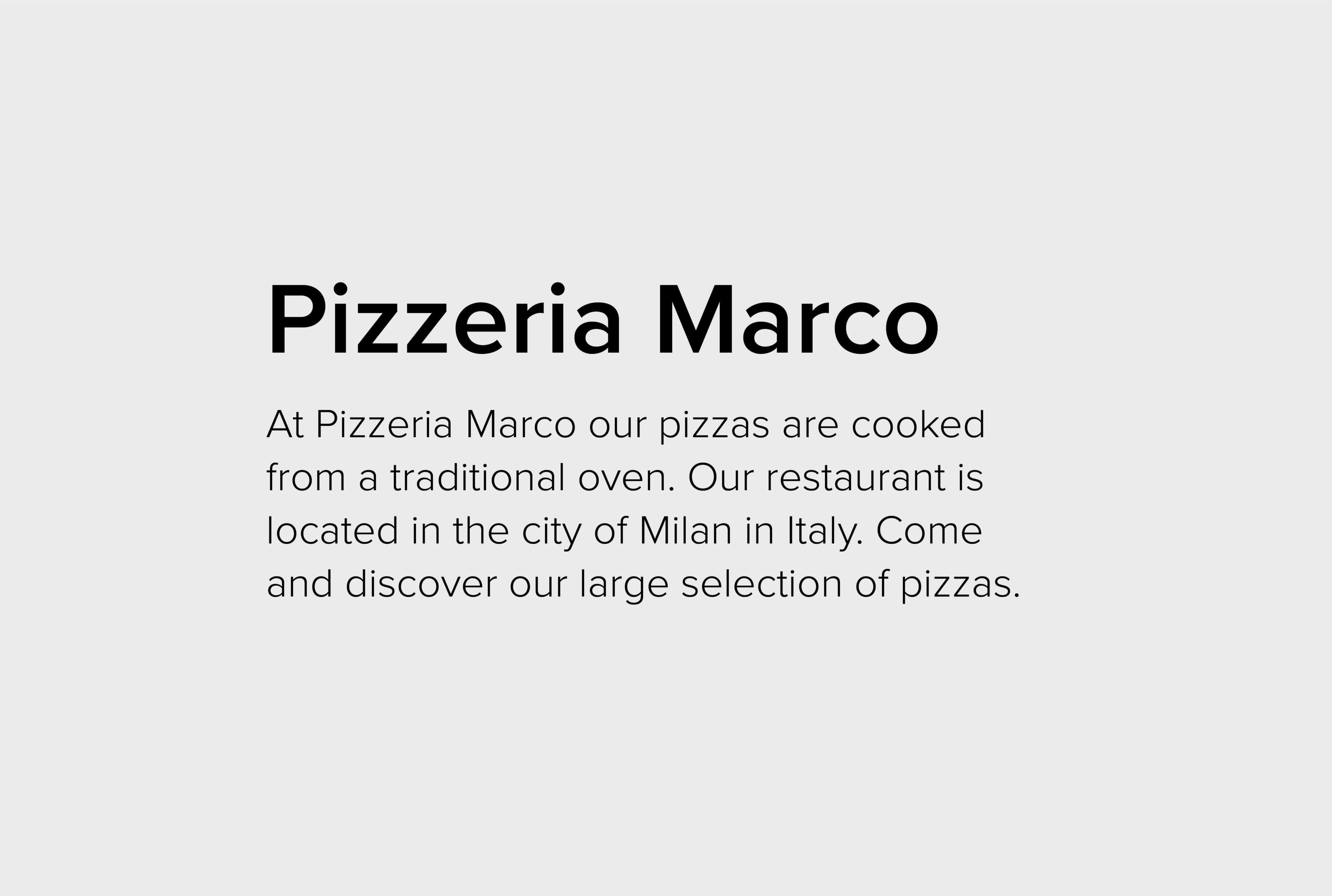
For example, the typefaces Joanna and Gill Sans were designed by the British typographer Eric Gill. Both typefaces work well and share the same style and skeleton. As illustrated in the example below:
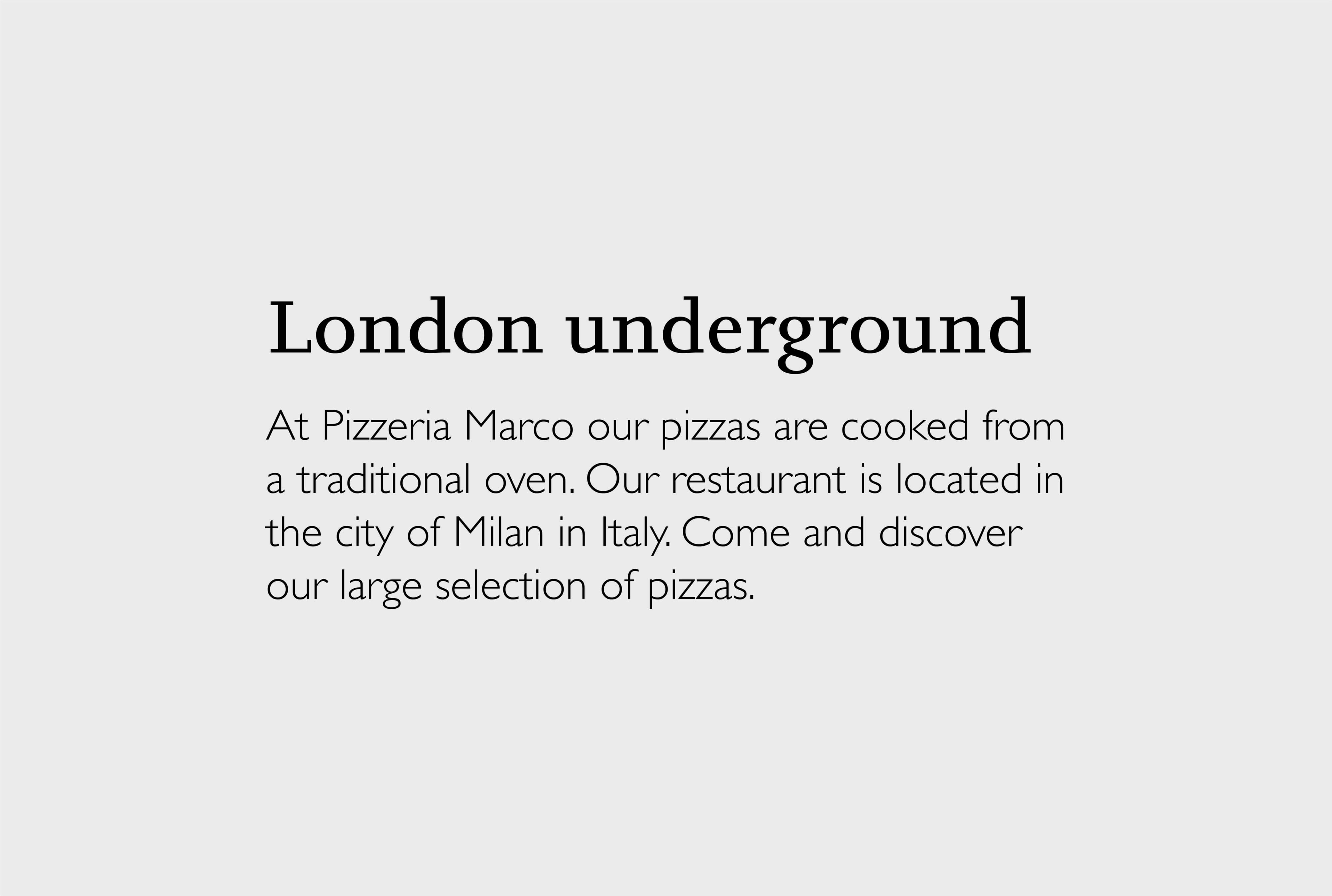
In the below example, the typefaces Johnston and Gill Sans combine well together as they share the same origin.
In fact, the typeface Gill Sans is also a British typeface which was designed based on the skeleton of Johnston. The type Johnston itself was created by the British typographer Edward Johnston.
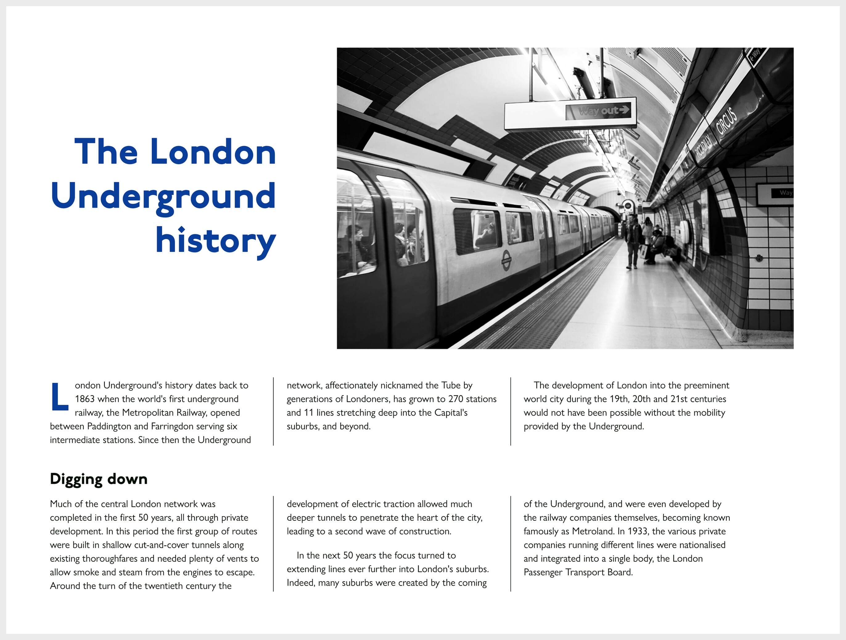
Here is a piece of article I art-directed pairing the two typefaces to bring together the style of the London tube underground. Note that the typeface Johnston is the one used on all the materials of the London underground.
Conclusion
Combining typefaces is necessary If you want to make your content accessible and pleasant to read.
When the typefaces are well chosen based on the context of use and aligned with the brand tone of voice, it brings personality to an interface. Moreover, these will show the user that you cared about their reading experience by spending time working on good typographic decisions. Good typeface pairing will help you create a design which looks unique and different from the majority of websites around the web.
Jerome Kalumbu
Further reading:
- Flexible Typesetting by Tim Brown
- On Web Typography by Jason Santa Maria
- Type Matters! by Jim Williams
- Web Typography by Richard Rutter
- Stop Stealing Sheep & Find Out How Type Works by Erik Spiekermann
Lastly, If you are lazy, the following sites can suggest or generate good font pairing for you ;):
If you want to learn more about this topic, read my book “DON’T START WITH VISUALS”.
