How to design better layouts for editorial & blog websites
Quick summary This article discusses how to enhance the personality and engagement of editorial websites through six design techniques: layouts designs, visual hierarchy, whitespace, typography, colour palette and graphics.
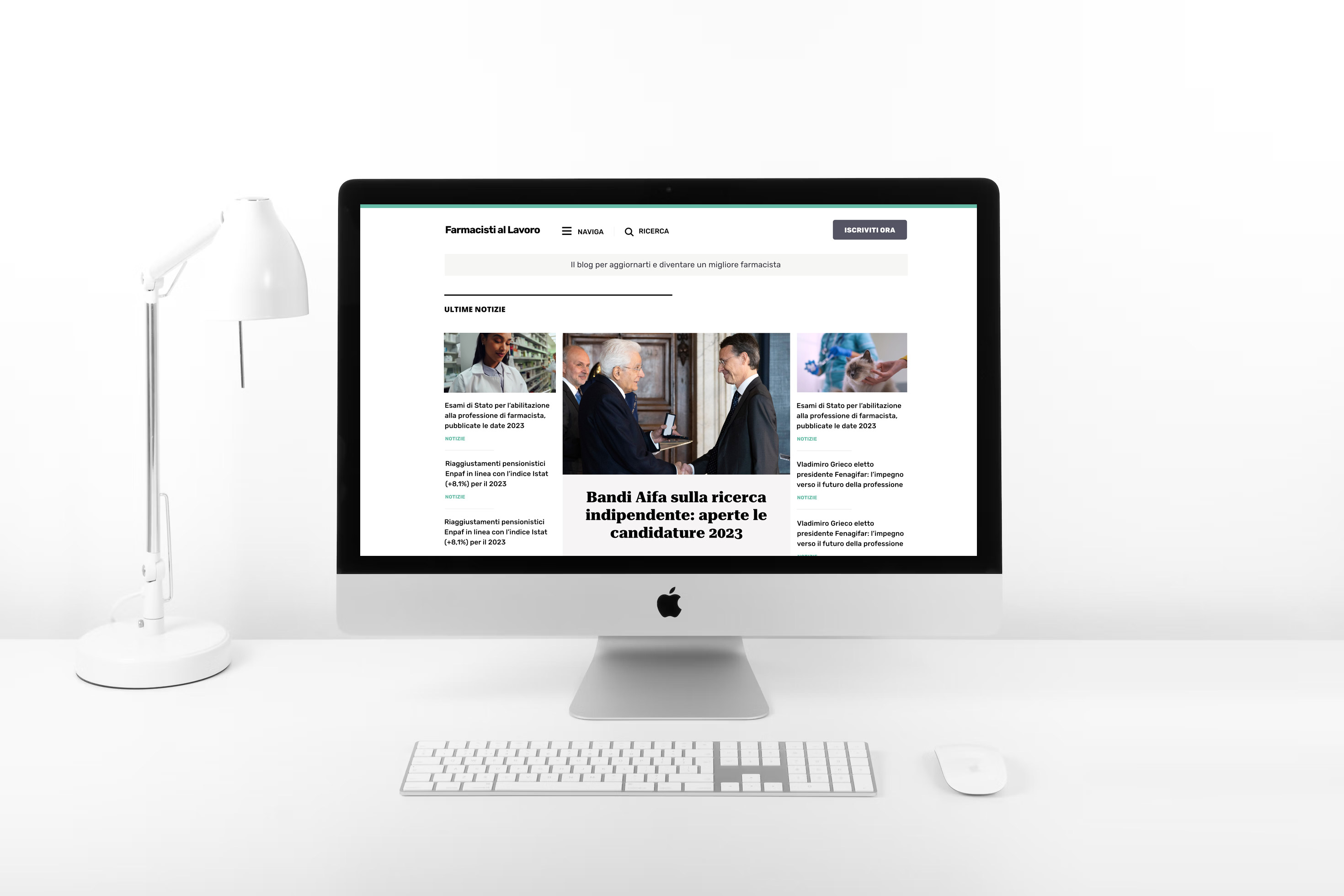
I recently completed the redesign of Farmacisti al Lavoro, an Italian editorial website targeting pharmacists willing to build up their knowledge in the industry.
In this article, I will share the six best design techniques I have used to add personality to the website, improve engagement and brand awareness.
Most editorial websites (especially those designed on WordPress with premade themes) lack personality and emotional appeal because all their interfaces are designed in a monotonous and predictable manner.
In other words, they are invariably presented and emotionally dull.
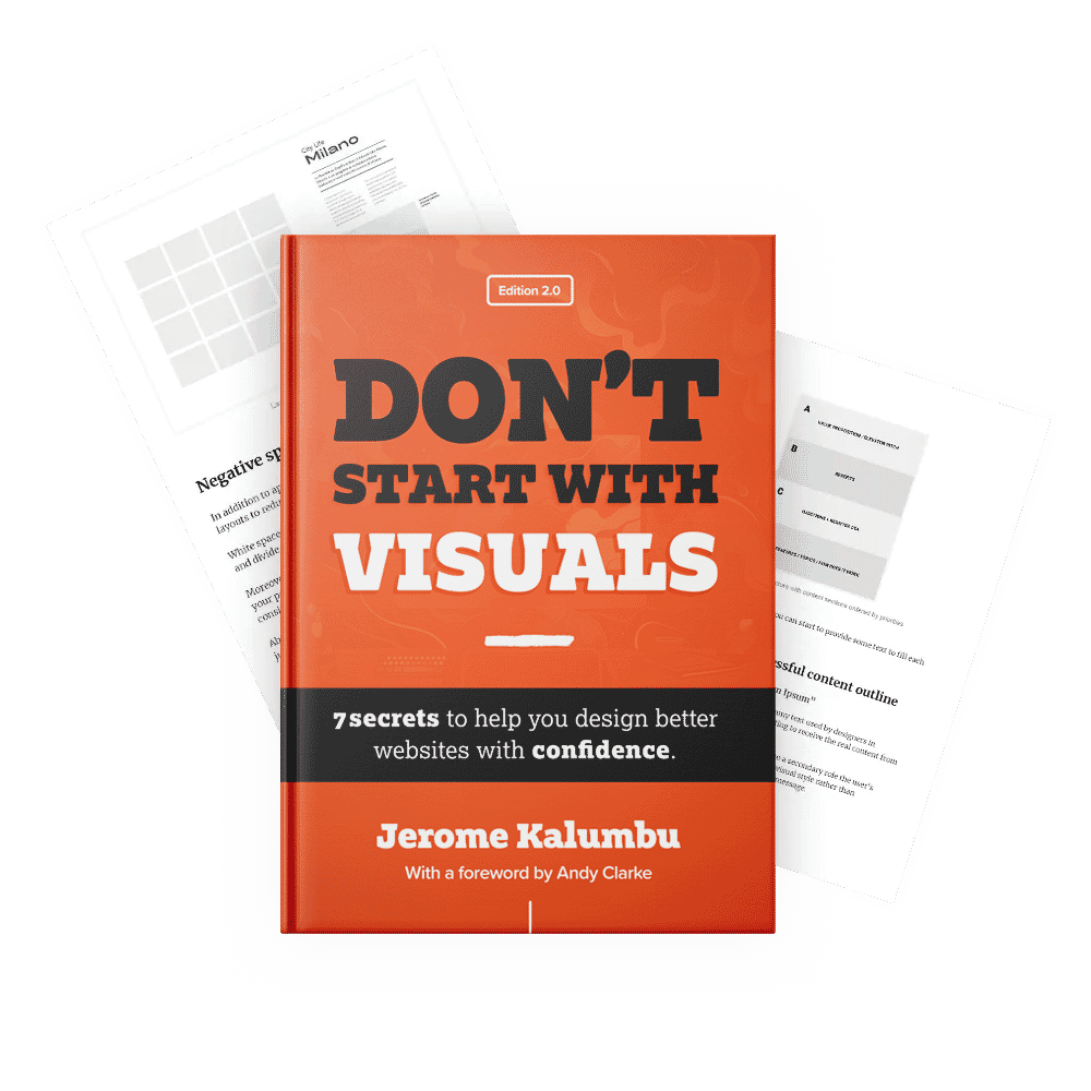
As I stated in my book “Don’t Start With Visuals”, most businesses lose sales because their websites fail to communicate their value proposition and express a distinctive personality.
On a website, the brand personality is expressed through the visual language including layout designs, typography choices, illustrations/images, and color schemes.
In order to bring back the lacking personality to the website, I had to review the above-mentioned design elements.
I hope that the tips I am sharing with you will help you to design interfaces that have personality.
1. Layouts designs
The purpose of a page layout is to arrange the content in a readable and attractive way to allow users to process, navigate, and stay engaged with the content of a website. In other words, a good layout improves the usability of an interface.
As I explained in chapter 3 of my book “Don’t Start With Visuals”, when a layout conveys a distinctive personality, it creates a memorable experience for users because their subconscious mind is triggered by the uniqueness and emotional appeal of the design.
Below is an example of the original web design devoted to personality; most pages were flat, overwhelming and built with no imagination.
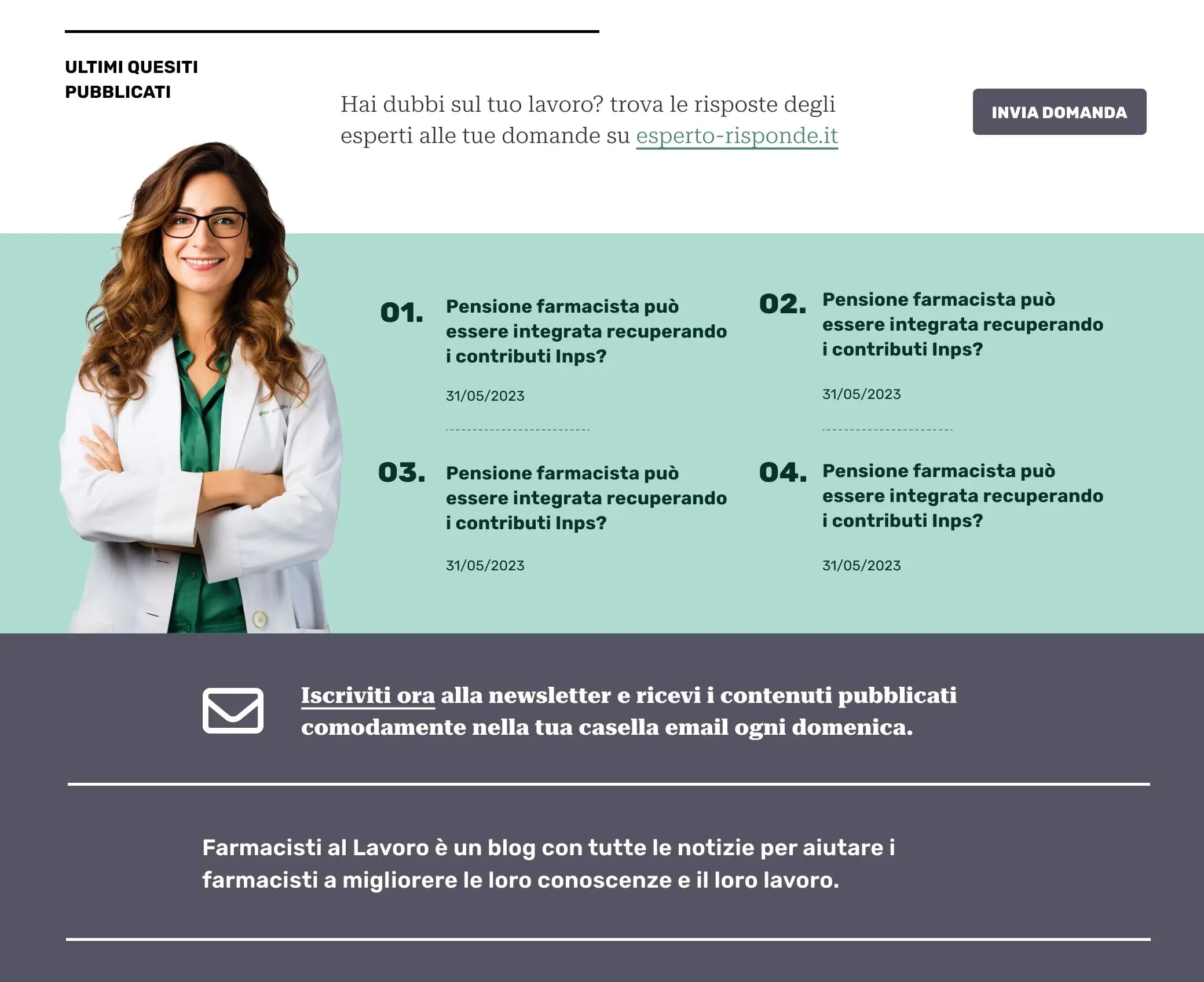
To add personality to the pages and improve the UX, I used a combination of different grids to create a variety of energetic and interesting layouts.
This approach allowed me to create different designs from most editorial websites running on a Wordpress platform.
On the homepage, I decided to mainly use a 4-columns grid in order to find original ideas about how to place the content on each section, instead of deliberating starting from a 12-column layout by default.
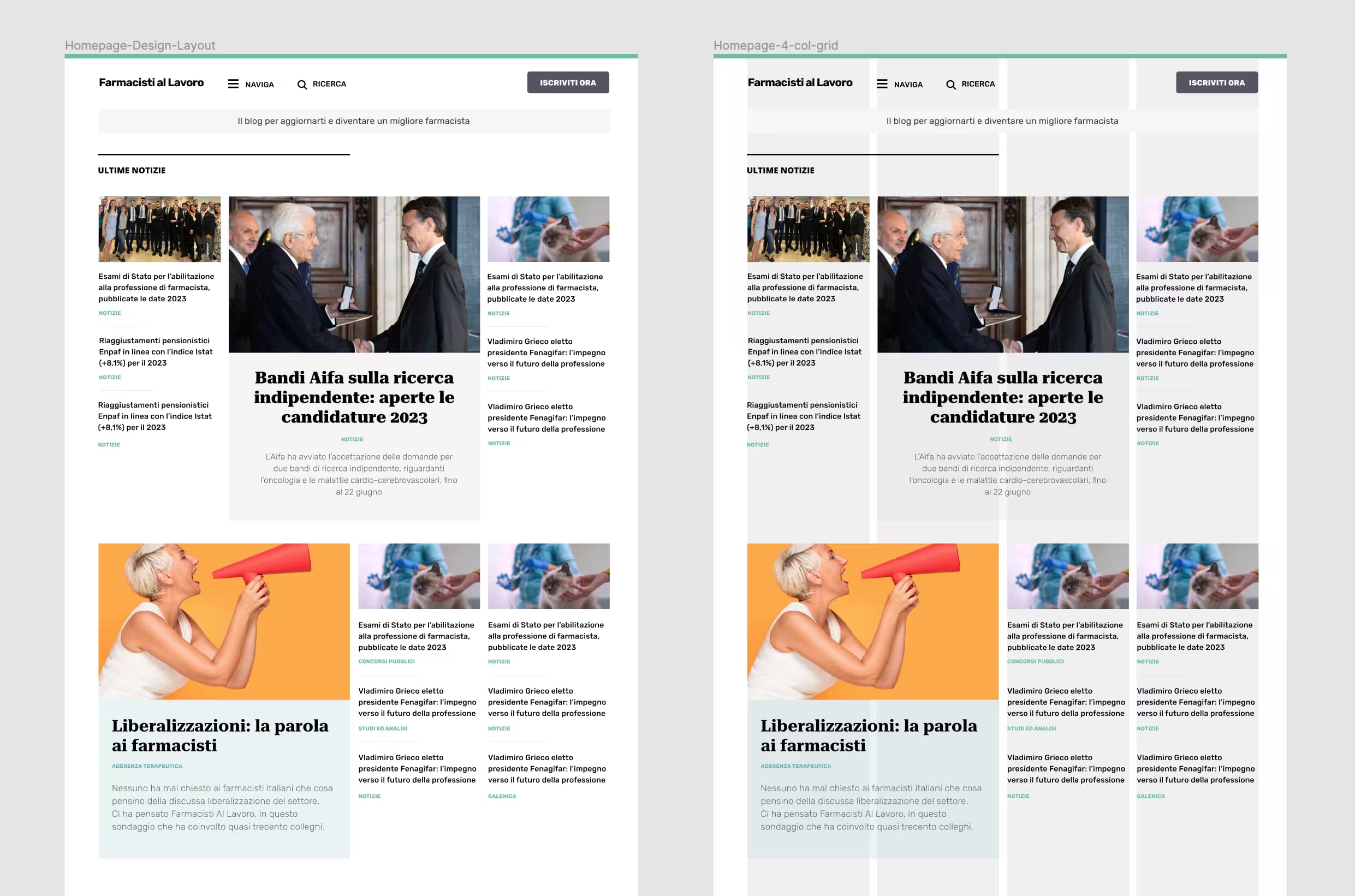
This approach also allowed me to change the ratio of modules to give the design some energy. I will speak about this further in the next section.
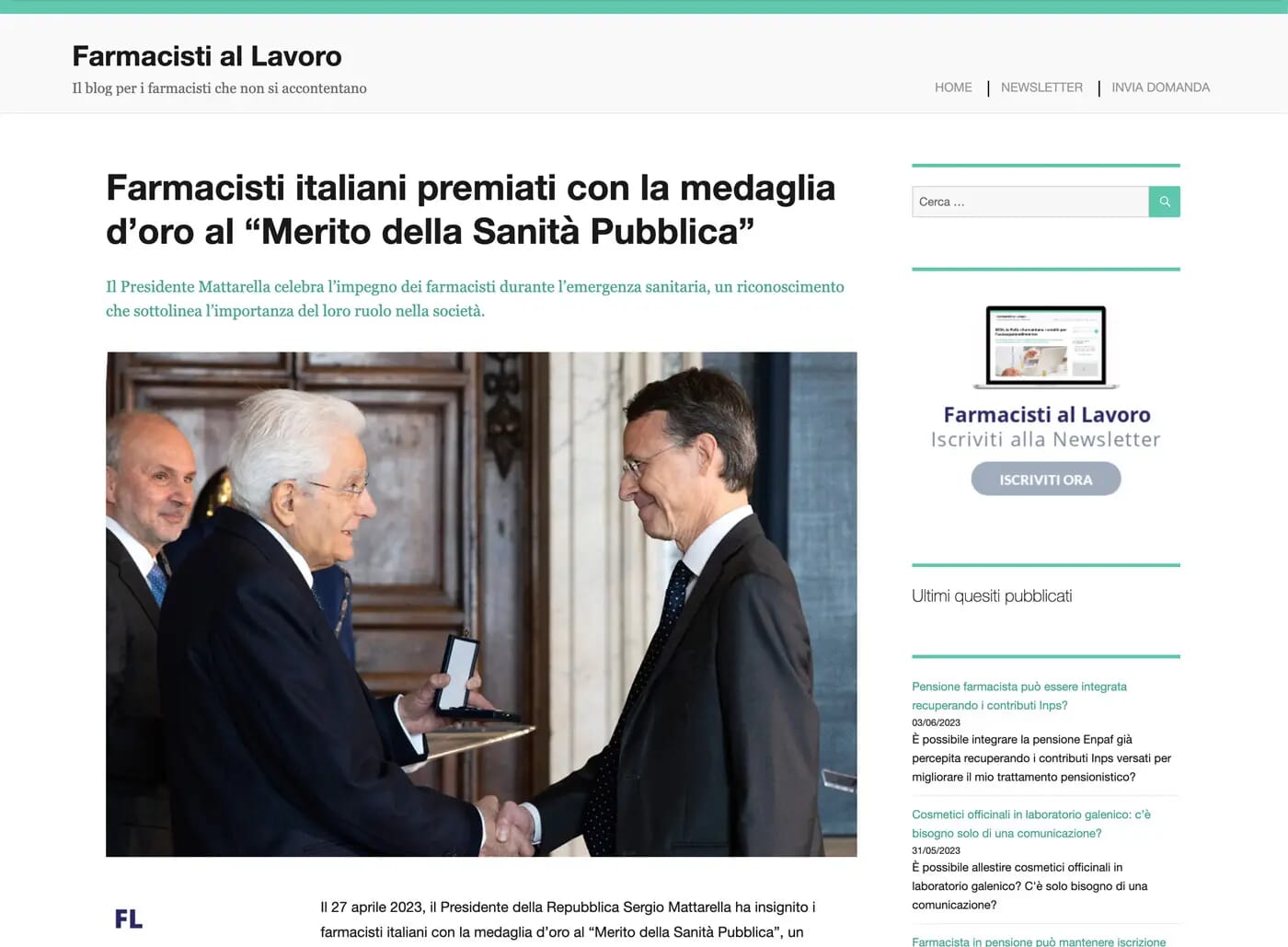
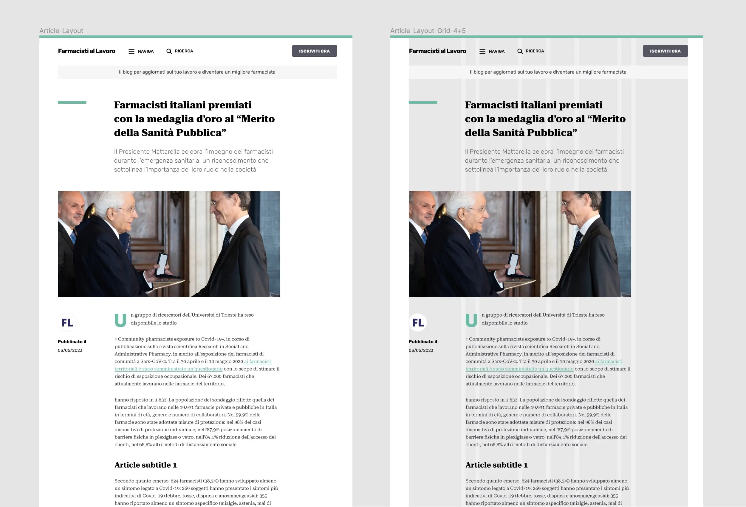
For the article page template, I used a compound grid 4+5 to create interesting stories that evoke emotions and aid users to read the text nicely.
Choosing the right presentation for your layouts is important to delivering the content effectively to users.
To pick the proper grid, whenever you need to organize the content, ask yourself the following questions:
- What is the purpose of my page? (to sell? illustrate something? inform?)
- What emotions do I need to convey with the design?
- What are the brand attributes I need to communicate?
- What do I want people to do?
- Which grid will convey the best what I try to say?
- Do I have images to play with different ratios?
- How big is the content to tell the story the best way?
If you want to learn more about the different grids available, Andy Clarke wrote a wonderful book “Art direction for the web” where he explains how you can use a grid imaginatively to create powerful and engaging layouts.
2. Type sizes and hierarchy
Scaling is important because, when used properly, it allows to differentiate elements by level of importance using sizing on an interface.
In other words, scaling adds variety to an interface and emphasizes the visual hierarchy. As Kelly Gordon explains in her article, 5 Principles of Visual Design in UX, bigger elements will likely be noticed first by users and understood as more important than less prominent ones.
The original design lacked personality because most of the elements, including modules were sized equally; everything was monotonous. Remember, without proper use of scaling, your interface will be flat and hard to use.
To add variety to the design and improve the visual hierarchy, I played with the scaling of modules and typographic elements:
Type scaling
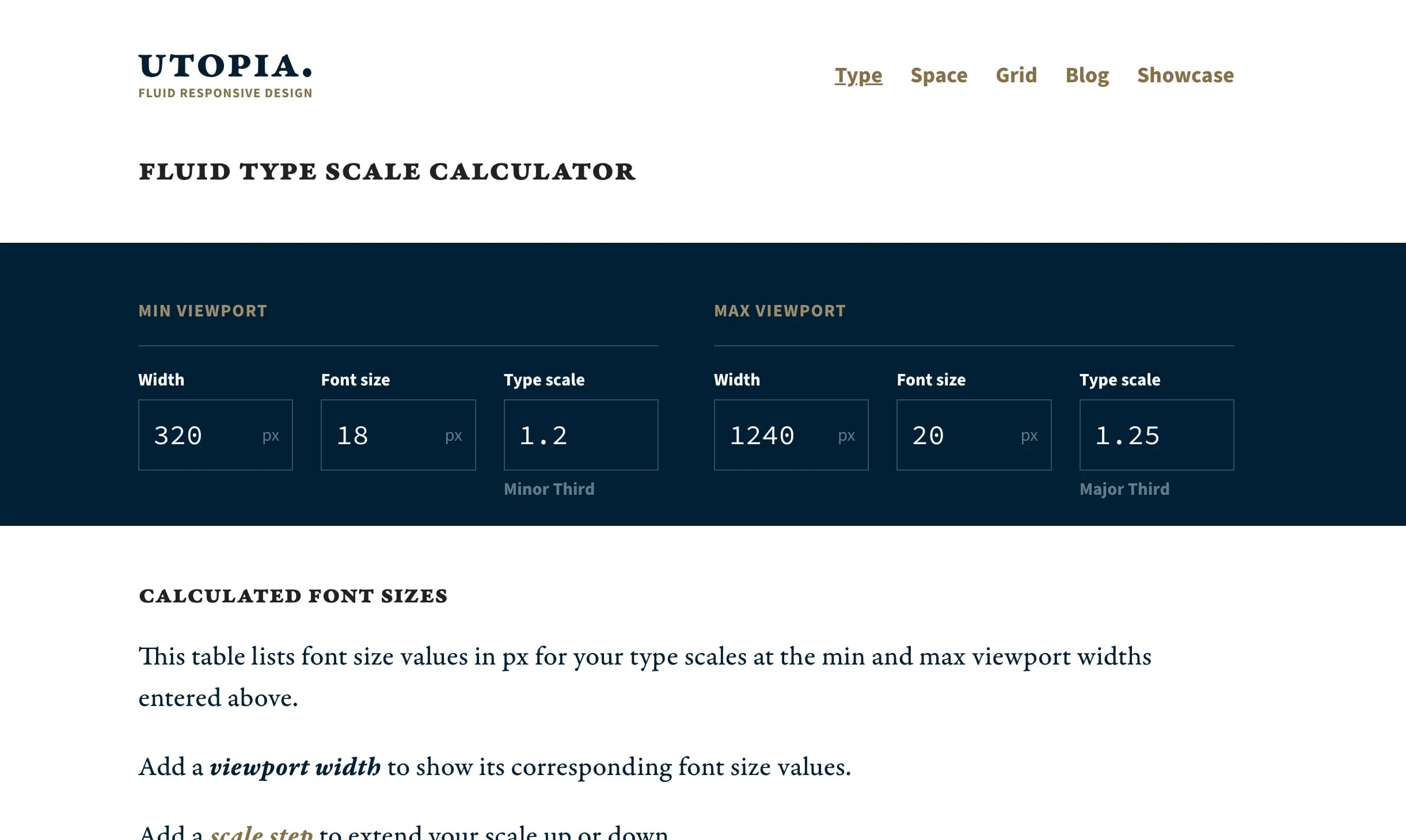
To define a clear visual hierarchy my first step was to use a modular scale from Utopia to systemize typography and make sure that I am designing interfaces that can be scanned easily.
In other words, based on the emotions I wanted to convey, I used font-sizes from a ratio-based scale to size typographic elements such as headings, subheadings, paragraphs, and blockquotes consistently.
Different sizes of modules
In addition to typography, I used scaling to change the sizes of modules to improve the visual hierarchy and add energy to the design.
On editorial websites, we call modules the individual elements that represent the teaser of a news story; they provide an easy way for users to navigate the content.
To aid users to scan the content, I used scaling to size modules differently based on their order of importance. For example, I made featured news stories bigger than regular ones.
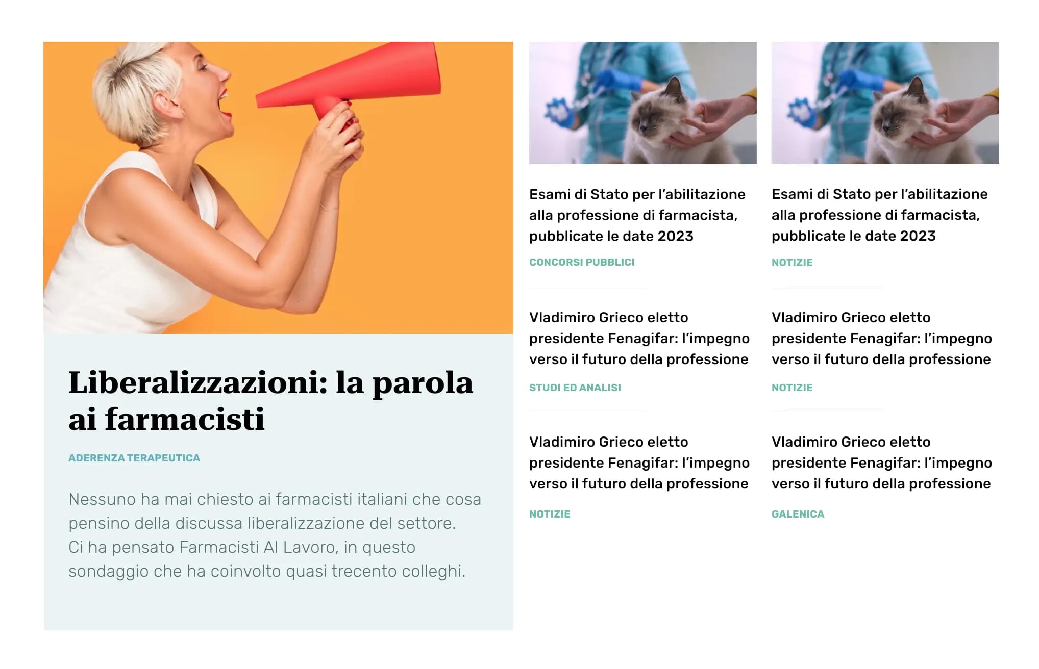
Changing the sizes of modules allowed me to add pace to the design and make it visually appealing.
3. Whitespace
Whitespace or negative space refer to the empty areas of an interface that give structure and reduce visual clutter on interfaces.
The goal of whitespace is to add breathing room to elements on an interface so users understand content relationships effortlessly, pause, concentrate, and reflect on what they are reading without feeling overwhelmed.
In addition to that, whitespace can be used to guide the reader's eye toward elements such as articles, images, and headings as call-to-action buttons on an interface.
Since the original design was cluttered because of a lack of white-space on interfaces, it was hard for users to process, comprehend, and access the content in the most effective way.
For this reason, when redesigning the pages, I used enough white-space to convey the brand’s personality and create asymmetric compositions that felt open and much easier to process.
When deciding how to add negative space in your designs, ask yourself the following questions:
- How can I add whitespace to improve the hierarchy of the page?
- How can I add whitespace to separate or group elements?
- How can I add whitespace to improve the reading experience?
4. Typography
Typefaces and typography are essential for creating a good reading experience and expressing the brand’s spirit on a website.
If typography looks good and feels right, people will stick around because they will understand that you cared about them by crafting a good reading experience.
That’s why, when designing an editorial site, one of the biggest challenges is to pick the right typeface to effectively communicate the message and calibrate typography properly to ensure a great reading experience.
To improve the reading experience of the website, I mixed the typefaces “Roboto Serif” and “Rubik” since they offer a great level of readability and legibility for headings and paragraphs, and they convey the characteristics claimed by the brand.
Then, I paid attention to typesetting such as establishing appropriate font sizes to create a clear visual hierarchy between headings and body copy, adjusting line-height.
For each article, I made sure to set a maximum content width between 70-100 characters and break the content with clear headings, subheadings, list, pull-out-quotes and avoid wall of words to ensure an optimal reading experience.
Whenever you need to work on typography, ask yourself the following questions:
- Which typefaces communicate the emotions I want to convey?
- Are the typefaces readable and legible enough for body text?
- What’s the purpose of these typefaces (e.g convey emotions, decorate..?)
- Do we have enough contrast between the fonts I am combining?
- Did I break down large content like articles with clear headings, subheadings, list, pull-out-quotes and small chunks of content?
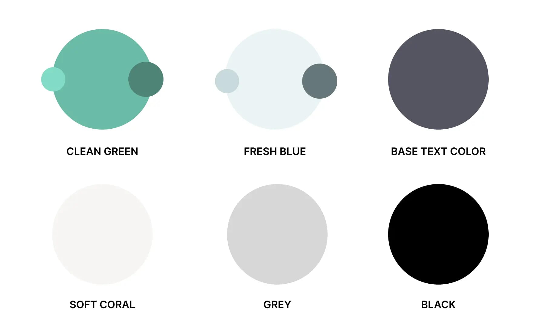
5. Colour palette
When you design interfaces, use a colour palette that effectively communicates the brand’s personality, mood and interactions, like links or call-to-action buttons to enhance usability and create visual interest.
For this website design, I defined a colour palette with fresh primary and secondary colours, including different shades of blue and grey to use as background color — or as colours for text, icons, lines, and interactive elements.
6. Graphic element details
In this project, I used several graphic elements such as lines, shapes, drop caps, icons or images to reinforce the personality and depth to the interfaces design.
These details helped me to connect the design to the brand and help users understand the content better. To get inspiration about the kind of elements to use, I found a wealth of ideas on print and magazine materials.
Remember, every element that you add should do more than just decorate. It should be intentional, convey meaning and enhance the content. Avoid adding noise to the design with elements that will clutter the interface.
Conclusion
The goal of this article was to explain how to bring back personality to dull interfaces—especially on editorial websites.
The solution to this problem lies in the good usage of the six principles that I have presented and described in this article:
- 1. Designing distinctive layouts with grids
- 2. Scaling elements to add variety
- 3. Whitespace to improve the readability
- 4. Good typography to improve the reading experience
- 5. Color palette to add emotional appeal and communicate functionality
- 6. Graphic elements to add depth to designs
By working on this article, I have learned the importance of designing unique interfaces in order to improve the user and brand experience.
In addition to that, this project has also taught me the importance of thinking out-of-the-box to design unique interfaces that add real value to customers and motivate them to buy.
If you want to see the live Wordpress site, click here.
If you want to learn more about this topic, read my book “DON’T START WITH VISUALS”.