Psychology is your superpower to design user-centred interfaces
Quick summary This article dives deep into how the human brain processes information and summarises several tips to help you design better interfaces for your users.

Understanding how people think and act is fundamental to designing effective user interfaces. Sadly, most designers ignore that cognitive psychology is the essence of how people interact, feel and process the information on a website.
In his article “What is Cognitive Psychology?” Bryn Farnsworth, Researcher in Neuroscience, gives the following definition for cognitive psychology:
“Cognitive psychology is the science of how we think. It’s concerned with our inner mental processes such as attention, perception, memory, action planning, and language. Each of these components are pivotal in forming who we are and how we behave.”
The human brain uses two systems to process information.
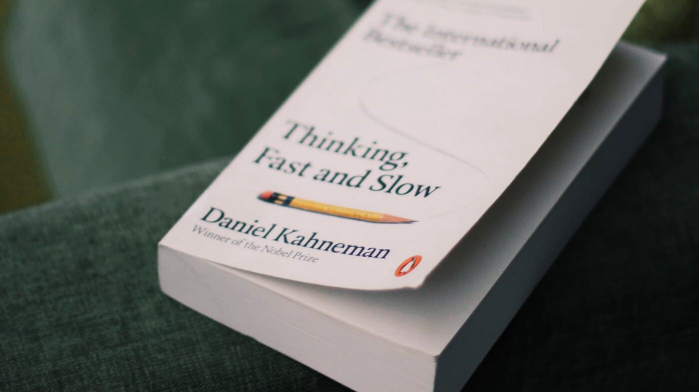
In his book, “Think fast and slow”, Daniel Kahneman explains that people use two ways of thinking to process information: System 1 (Subconscious) and System 2 (Conscious).
Whenever we are awake, both systems are active; System 1 runs automatically and System 2 operates in a low effort mode in which only a fraction of its capacity is engaged. Daniel Kahneman argues that System 2 articulates judgement and makes choices, but often endorses or rationalizes ideas and feelings that were generated by System 1.
In sum, System 1 enables us to quickly identify the information relevant for a task or problem, and System 2 uses this input to execute or inhibit action. (e.g acting on a website).
Let’s have a closer look at these two systems and why they are important to consider when designing a website.
System 1: is fast, emotional, impulsive and automatic.
System 1 is fast, emotional, impulsive and operates automatically with little effort and no sense of voluntary control; It is where all our thoughts are controlled automatically—most of our behaviour is emotional and driven by System 1.
According to Therese Fessenden, UX Specialist, System 1 is fast at recognizing simple relationships or identifying familiar patterns on an interface. For example System 1 allows you to make instinctual decisions based on previous experience and mental models.
Also, System 1 is responsible for judging if a product is trustworthy or safe to use; that’s why a website should feel familiar to its users to feel safe and be easy to use.
Since System 1 is responsible for forming impressions and feelings that are the main sources of our beliefs and deliberate actions, a website must have refined aesthetics to convey trust and encourage people to act.
To understand better how System 1 works, let’s take the example of a user who lands on a website. In less than a millisecond, System 1 will be responsible for making hundreds of decisions and drawing conclusions such as:
- Did I land on the right website?
- Should I trust this website?
- Is it safe to proceed or should I avoid it?
- Does this website look familiar to me?
- Would I get spammed if I subscribe to this newsletter?
- I really like this design!
- ...
Note that all these thoughts happen in a fraction of a second, before System 2 processes the information.
Loss aversion bias: System 1 fears loss
Yet in his book, Think Fast and Slow, Daniel Kahneman uses the expression “losses loom larger than gains” to explain that in people, the pain of losing is greater than the satisfaction of an equivalent gain.
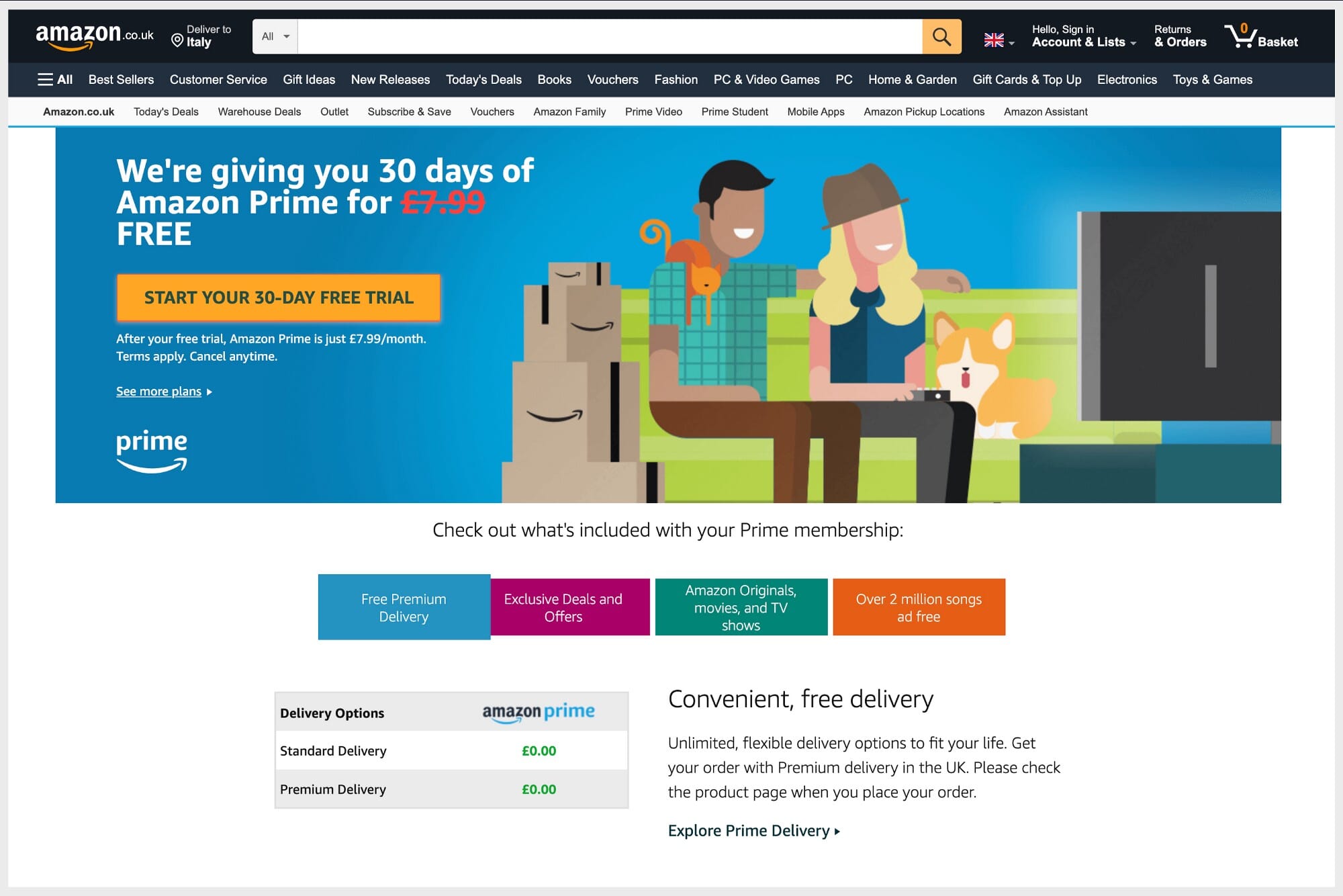
In fact, you must be aware of this concept whenever you design a website since they often require the user to give up money when they buy a product/service or their personal data when they subscribe to a newsletter, for example.
Since System 1 fears loss, Paul Boag recommends that designers emphasize more benefits than features in their interfaces to help the users overcome their objections; another great example to help the users overcome their fear before investing in a product or service is to give them the possibility to try it for free before purchasing it.
That said, in UX Design, user research is vital to better understand the users’ mental models, goals and objections to design a site, system, or app aligned with their expectations and needs.
Remember, designers should consider seriously designing for System 1 since it influences largely decision making.
System 2: is Slow, deliberate and Analytical.
However, System 2 is slow, deliberate and allocates attention to the effortful mental activities that require it. When System 1 runs into difficulty and fails to answer a specific problem, it calls on System 2, which supports more detailed and specific processing to find the answer.
System 2 is responsible for conscious thoughts that need concentration such as focusing hard on a task, learning how to use a new interface, solving complex tasks or a difficult math problem.
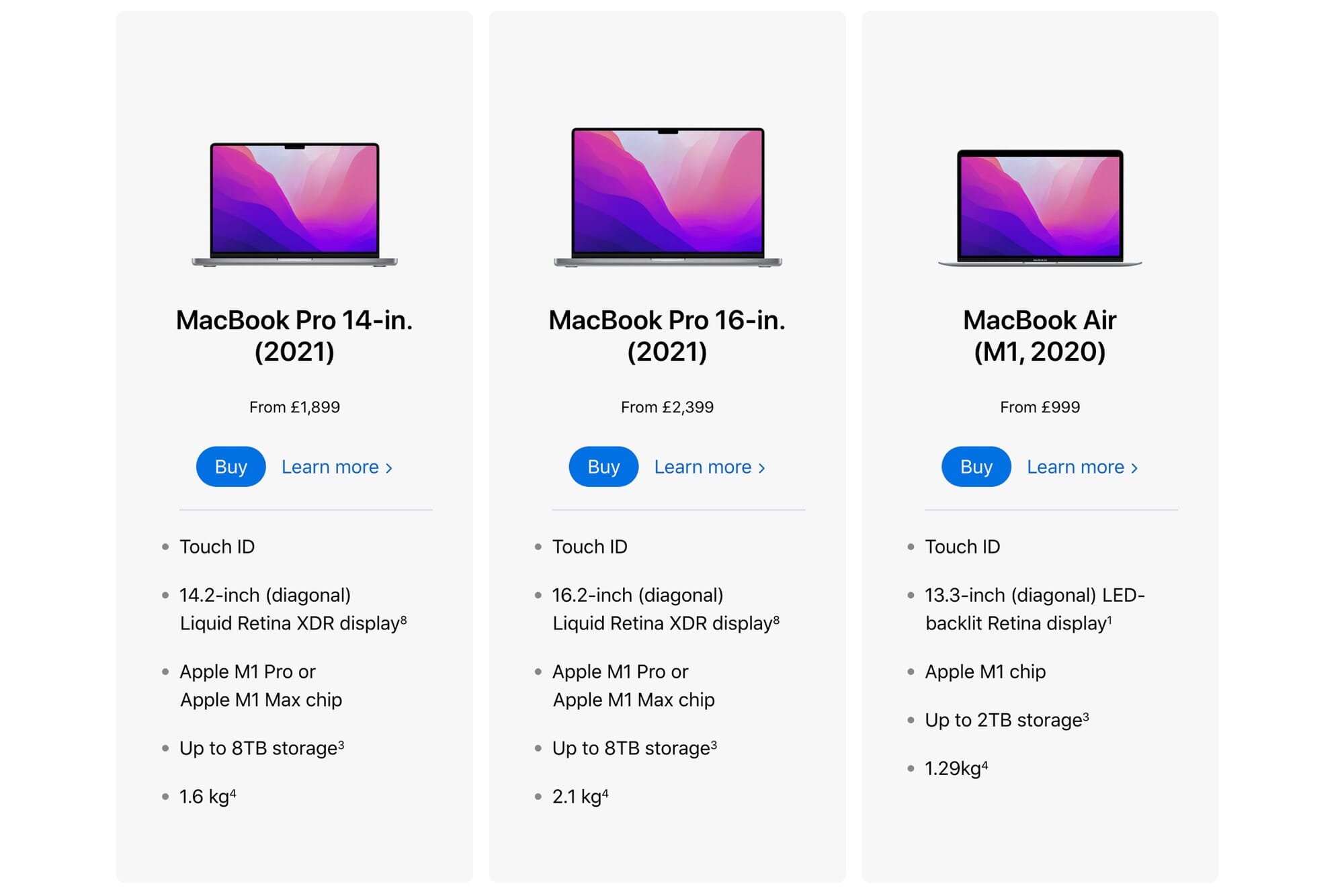
For example, when browsing a website, a user will rely on system 2 when comparing products with different prices and information. In order to do that, he will need to concentrate and use it’s working memory to remember the information. Remember, every element regarding information architecture, including, labelling and content are processed by system 2.
The human working memory is fallible.
In UX Design, a common concept related to working memory is the concept of cognitive load. Hence, if a task provokes a high cognitive load, it means that it relies heavily on the working memory.
For example, when an interface is hard to use, people are generally frustrated and sometimes furious because it takes them lots of mental effort to process the information and, therefore, achieve their tasks. This happens because System 2 can get overwhelmed and tired quickly since the working memory has a limited capacity.
For this reason, the website you design has to present the information in a clear and digestible way to help the user access the information they need effortlessly.
Designing for System 1 is your primary goal.
Remember, before System 2 kicks in; System 1 is already in operation.
So, to make a positive first impression and capture the user’s attention, the design of your website must be appealing — art-directing your website is a compelling way to design pleasant and memorable interfaces. Below are some tips that will help grab the attention of System 1 in your interfaces:
- Clear visual hierarchy;
- Expressive/High-quality typefaces;
- High-quality imagery;
- Simple colour palette (Limit your palette to three colors)
- Rounded shapes/corner;
- Align your design elements on a grid;
- Focus on the benefits instead of features in your copy to make System 1 less feel the sense of loss.
Remember, everything regarding information architecture, including labelling and content, will still be processed by System 2. So, for example, make sure to apply the following tips to make sure not to overwhelm System 2 whenever it is in use:
- Speak the user’s language in your interfaces;
- keep the primary users’ tasks simple to achieve to avoid mental fatigue and frustrations;
- Rounded shapes/corner;
- Separate the content into chunks of information to avoid clutter;
- Maintain consistency and use standards design patterns so the user finds the interface familiar;
- Avoid competing call-to-actions in your interfaces; make sure that the primary call-to-action is more prominent against the secondary call-to-action.
Conclusion
To conclude, designing for System 1 is vital. Remember, System 1 is judgemental — it reacts emotionally and instinctively. Also, keep in mind that a tailored website for your users will look safe, familiar and easy to use.
Whenever you work on a UX project, always research your users to increase your chance of designing a website that meets their expectations; this will also help you prioritize the content and features that support their primary goals in your interfaces.
Lastly, to go further in learning about how to design better interfaces for people, I highly recommend that you read the “10 Usability Heuristics for User Interface Design” written by Jakob Nielsen.
Jerome Kalumbu
Recommended Articles
- How to Use Psychology the Right Way to Improve Conversion by Paul Boag
- First Impressions Matter: How Designers Can Support Humans’ Automatic Cognitive Processing by Therese Fessenden
- Mental Models by Jakob Nielsen
- 10 Usability Heuristics for User Interface Design by Jakob Nielsen
- What is Cognitive Psychology? by Bryn Farnsworth
- Working Memory and External Memory by Raluca Budiu
- Think Fast and Slow by Daniel Kahneman
- Emotional Design by Donald Norman
If you want to learn more about this topic, read my book “DON’T START WITH VISUALS”.