How art direction will help you create masterful web interfaces
Quick summary In this article, I explain the importance of Art-Direction as well as my approach to art-direct a design in order to create distinctive digital interfaces.
The importance of Art Direction
Although they might understand some its aspects like typography, art direction is a practice that is often neglected and little understood by designers. On typography, you may have read our article “Great interfaces are made of good typography” published on Medium last year. Back then, we sought to explain how using the right typography can help good designers capture an organisation’s style and translate it into a website, thereby provoking deep emotions within users. Art direction is that, plus the management of many other components of design and it leads to great compositions.
The fact that art direction is little understood, even by professional designers, is a real shame since it singlehandedly has the potential to guarantee coherent and memorable experiences across channels. Now, as it can be difficult to figure out how to art direct your work, we have laid out useful concepts in the article below, hoping to shed light on the practice and help you better understand it. For this, we follow the design process chronologically in “Steps” and detail the value that art direction can bring to your designs.
The Definition of Art Direction
Andy Clarke, the designer, describes it as
the art of distilling an essential, precise meaning and purpose from a piece of content.
It can be defined as the process of selecting the best way to communicate a message using the panel of tools at the web designer’s disposal: colours, words, layout, images and typography. A right mix of these is what you must reach in order to suscitate emotions through your web, system or app creations. Further, art direction will also make people better understand content, perceive moods, get a feel for a brand or recognise its visual identity.
Problems are faced when art-direction is lacking
Many designers tend to forget that a website is, first and foremost, a means of communication. They can be tempted to design websites using quick fixes; i.e. themes or frameworks that saves them time but that do not take full consideration of project goals. In addition, they may often jump straight into creating the website’s visual language without paying full attention to the moods and feelings they need to convey. This shows a lack of art direction. And, when art direction is lacking, typical symptoms appear. Websites become mere replicas of one another: i.e. little more than barely modified templates, dry, soulless, unmemorable and failing at establishing a deep emotional connection with their users.
The fix
To ensure your web design radiates soul and personality learn to art-direct the products you design. You need to know how to infuse character into them as well as to establish an emotional connection with your users.
Another important clue is included in another one of our articles, entitled “How to define a clear strategy”. There, we stress the importance of defining crystal clear goals from the very start of the project. Click on the link above and open the article in a new window; it will show you the basics of interface design and the steps to follow before the art direction stage.
- Infuse the organisation’s brand identity into your creation,
- Create something striking that will stand out,
- Capture your audience’s interest,
- Investigate rather than second-guess the design choices you should offer,
- Keep the original goals in mind from start to finish,
- Identify the main target audience of your website,
- Determine what specific messages must be conveyed,
- Define the desired impact you wish to have on your audience in terms of feeling as they interact with your product,
- Seek to add value (how does your design contribute to this?),
- Research and absorb the essence of the brand as early as possible from the beginning of the project.
The last point is particularly important: defining the organization brand attributes with your client is a great starting point that establishes bases for clear and solid design. Your clients know their brand better than anyone else and can explain the what, i.e. what they wish to communicate and sell through your design. As for you, you handle the how, i.e. how this will be implemented through design. You facilitate the brand’s communication and help it leverage a web solution that carries its voice.
Investigate at the start. Keep original goals in mind all the way. Create something striking that will do justice to the brand, to you as a designer and to web users.
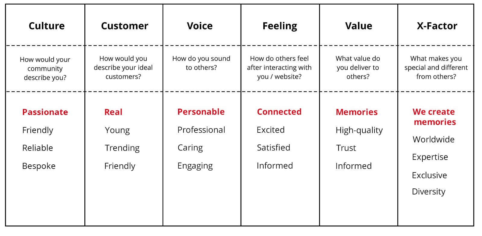
Step 1: Identify the brand attributes
As an example, below is a simple exercise we do with clients to ensure their expectations are understood. Together, we list their brand attributes and select the most important ones within each pillar. This helps you think about your design from the right angle and then take the right direction. Remember that visual design and art direction grow out of existing brands.
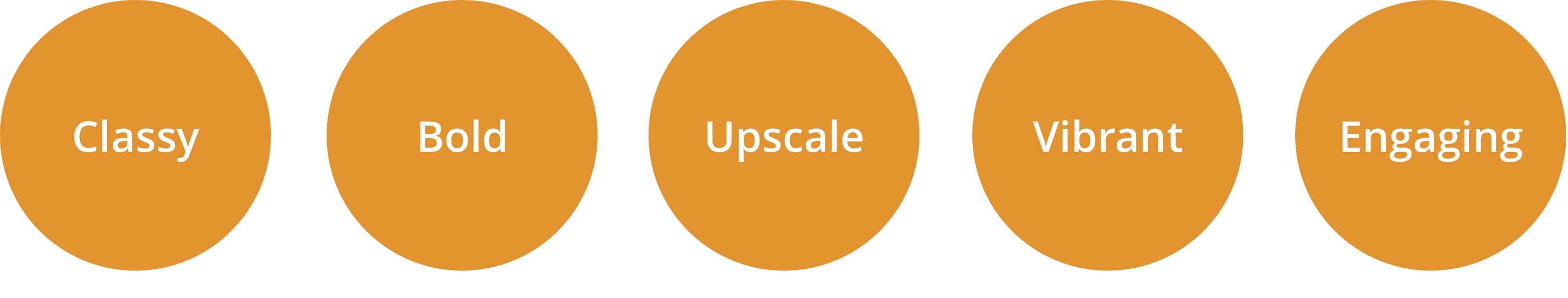
Step 2: Tone of voice
In addition, understanding the “tone of voice” of the brand will be key in choosing suitable typefaces that accurately and efficiently communicate. Think body copy, button labels and other UX copywriting. Moreover, typefaces are essential to convey brand spirit and visual identity. Turned into feeling, single words will tell you more about the connection you want to establish with the user through design. For instance, the words in the table above will give you a good idea on the best way to art-direct the types, negative space, images, colours and micro-interactions in your website.
Step 3: The direction the design must take
After defining the brand traits in our larger table, together with the client, we narrow down the list to only a few words which we can then visualize and use to give direction to the design.
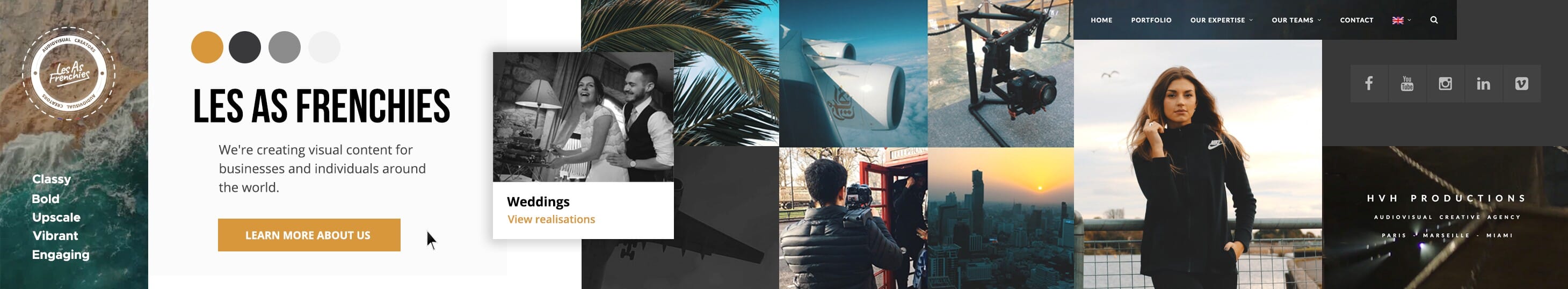
Step 4: From thought to image
Once this exercise is complete, it becomes clear that the design will not be disconnected from the brand or audience. Typically, this step is concluded by creating a stylescape which translates thought process into visual composition. The stylescape allows you to tell the story of your design, the audience of the project and the global visual language to use. A stylescape that seamless aligns with a brand speaks volumes!
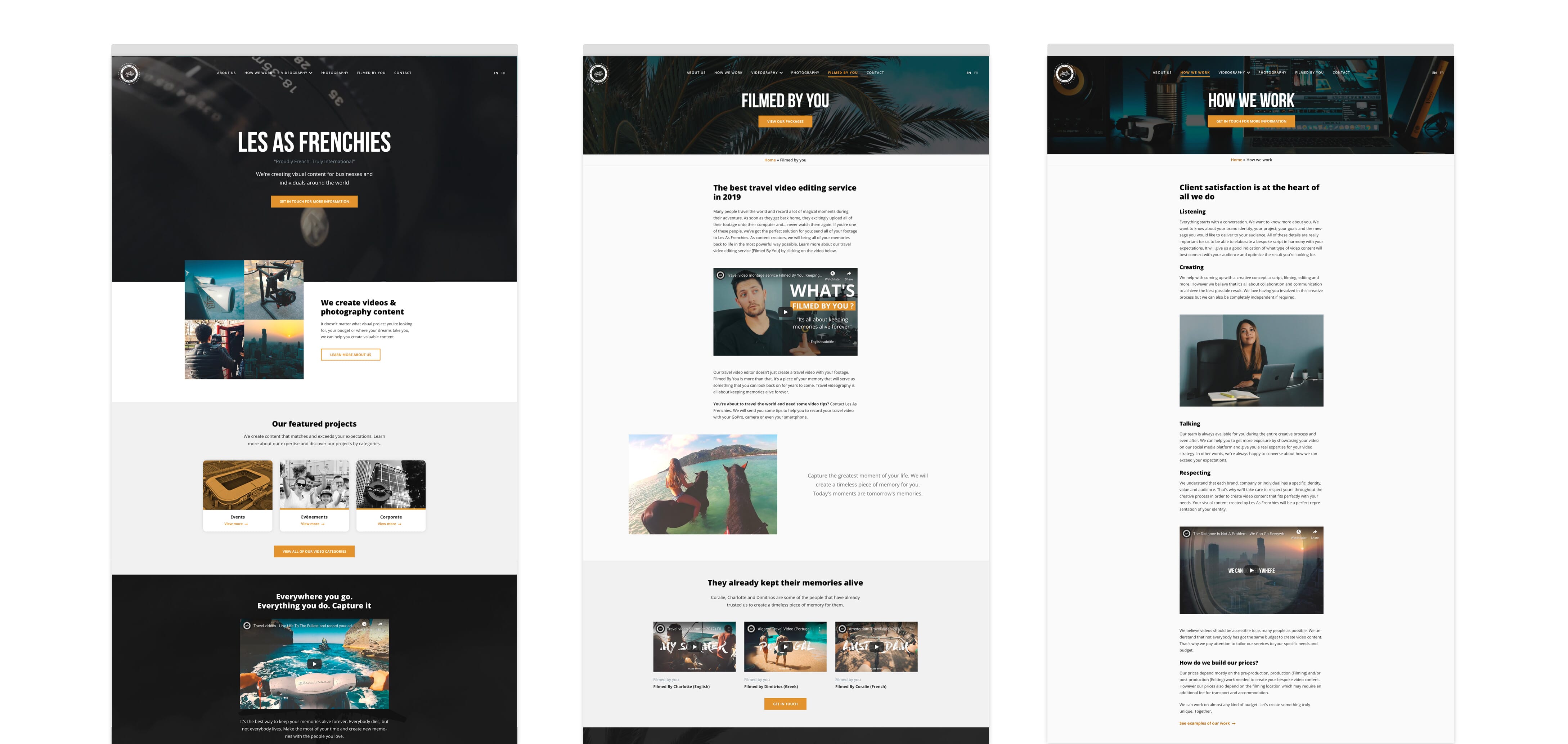
Step 5: Layout — what goes where…
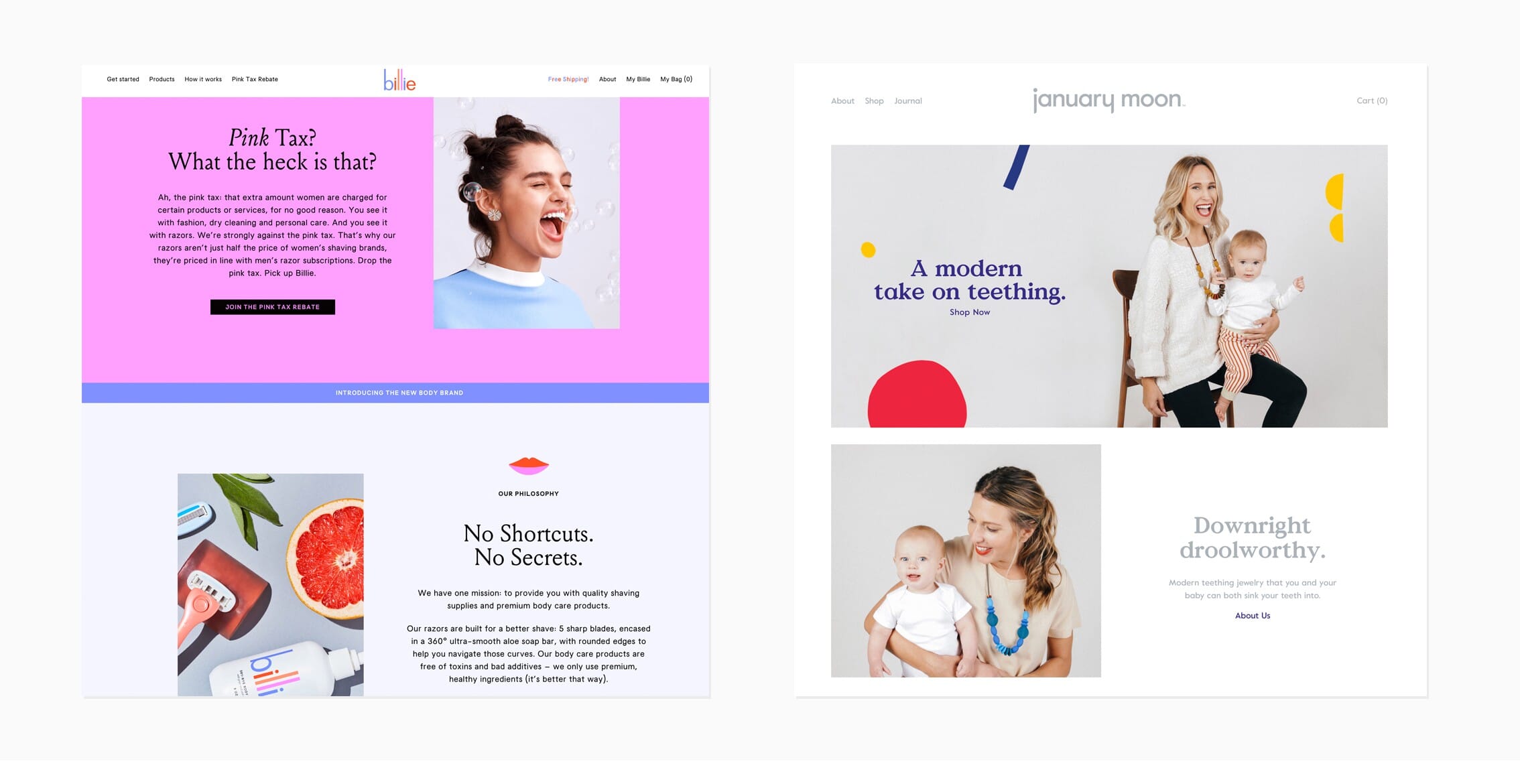
On a website, layout and typography play an important role in delivering a message. Together, they constitute the core of a website’s communication. As a result, keeping them in harmony is important. Generally, when you successfully pair types of font, use appropriate images, balance white space properly, use brand attributes and design, a personality emerges and the website stands out.
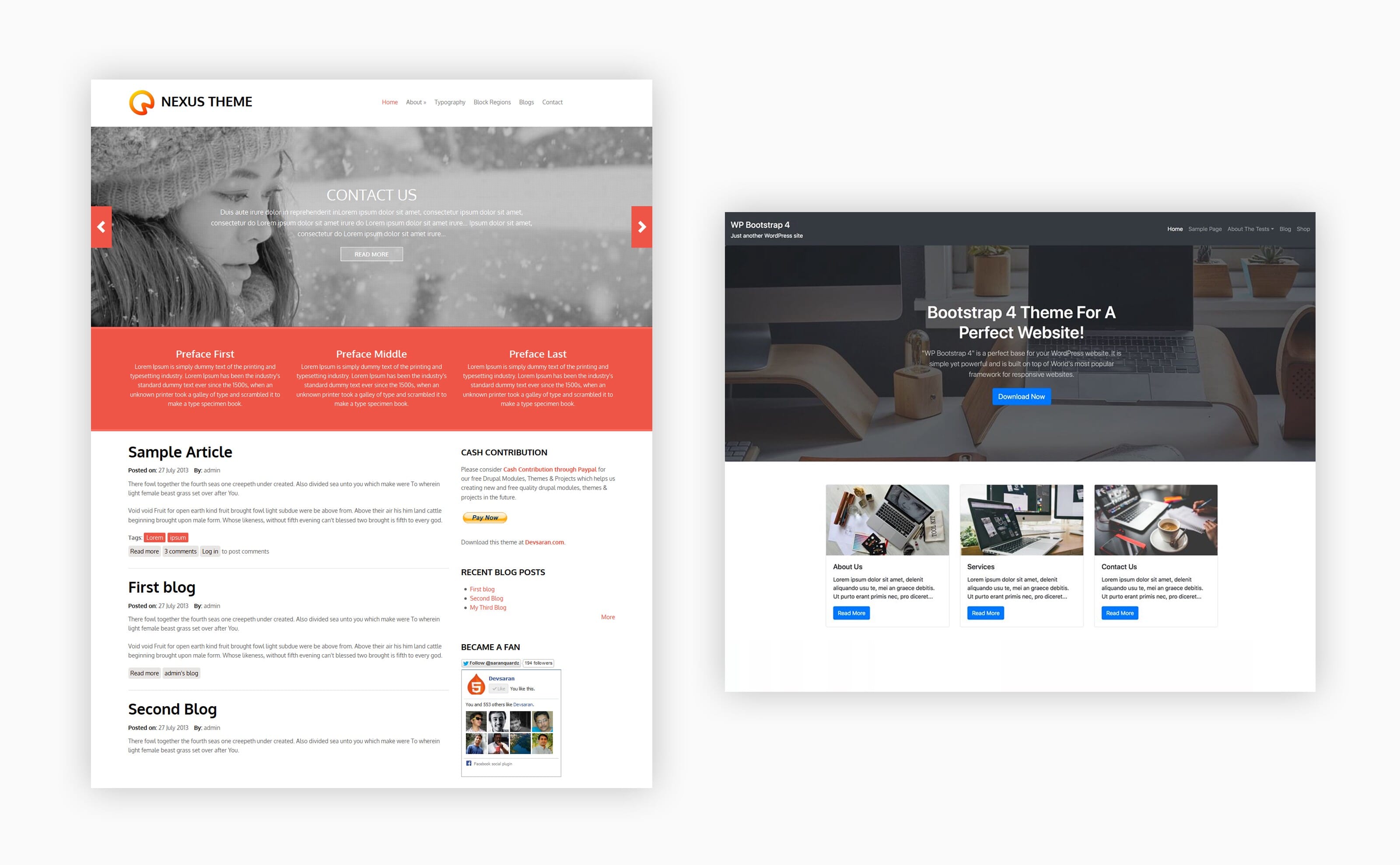
A good visual design must not only communicate, support, but also lead the user throughout their interactions. In fact, it must allow them to accomplish what they sought to do in the first place. When it comes to your design, make sure to start designing from real content and keep the goals in mind. This will create meaningful interfaces. Layouts suggest what needs to be read first and how much attention should be given to any part. In a sense, layout is storytelling Below is an example of three distinctive layouts we art-directed in order to provide different feels:
- On any given page, what message do I need to convey to the user?
- Why did the user come on this page?
- What actions do I want them to take?
- What emotions do I want to create?
These questions give clarity on the type of layout to use in order to organize the content on a page. Using real content will deliver real results.
Conclusion
Use Art Direction to Magnify your Communication and Showcase your Talent.
As a competent UX designer, what you must aim for is to produce increasingly better designs. This is something that art direction makes possible. Remember that the prime purpose of visual design is not only decoration but also communication, Therefore, start today by applying the basics of art direction in every digital project you embark on. Your designs will become meaningful, they will help people connect emotionally and gain in efficiency. Art direction will determine the difference between a regular and brilliant creations. This, because good design choices will be made from the beginning of the project, and guarantee the success of your operation, from customer requirement to a masterful web interface.
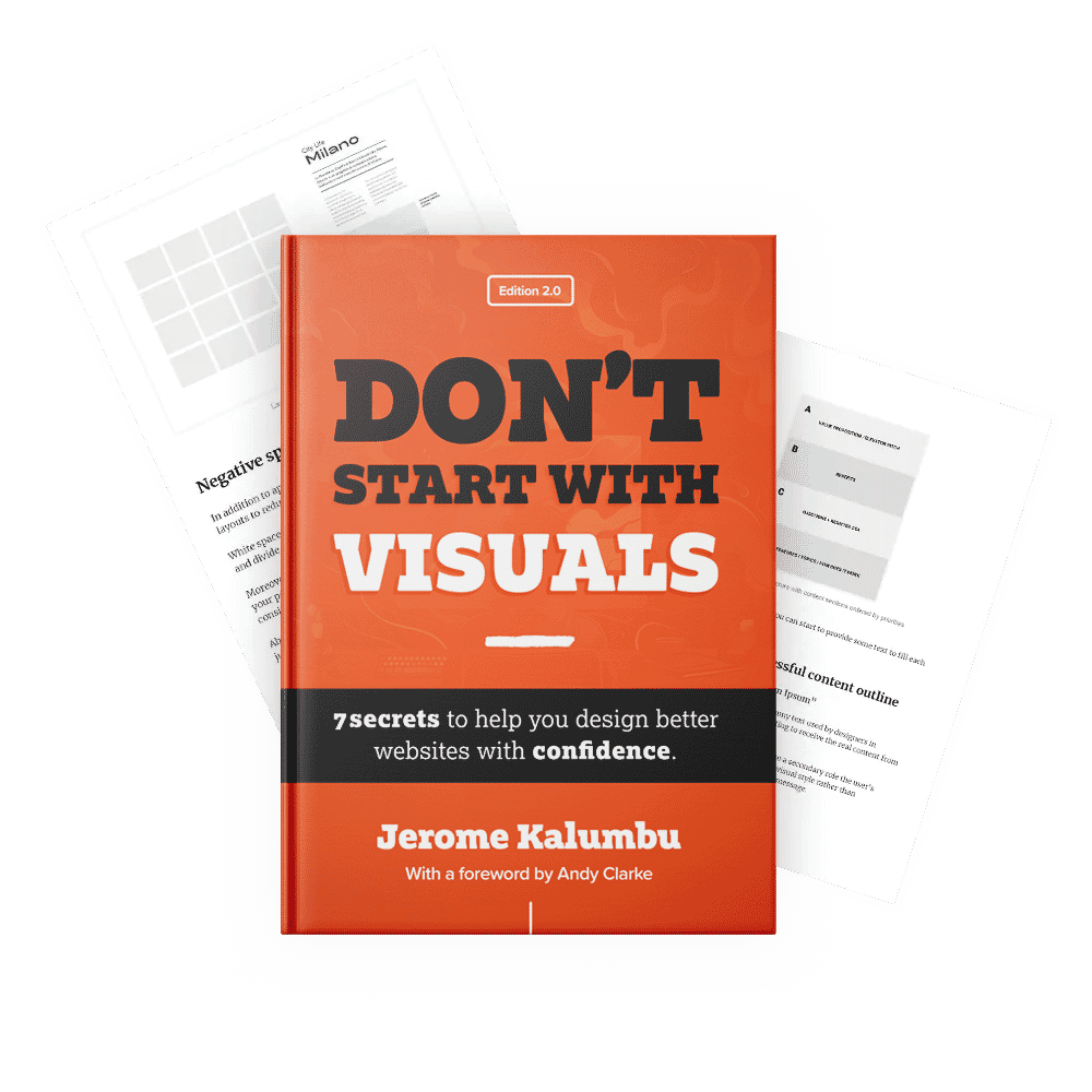
If you want to learn more about this topic, read my book “DON’T START WITH VISUALS”.