Typesetting can break or make your layout
Quick summary Knowing how to use typography can elevate the quality of your design and make an impact on users. A badly typeset content can break your layout and make you look amateurish.
Every day millions of people read different types of content on the web.
Typography influences how we comprehend the content and feel about the experience and the brand — for this reason, the reading experience on websites must be excellent.
Using Typography creatively and thoughtfully is a chance to stand out and make your interface look professional, attractive and functional.
Sadly, when websites are dry and poorly typeset, it's difficult for users to process the information and comprehend the message — when typography is overlooked, the design looks amateurish.
I wrote this article to help you create engaging interfaces with good typography.
Typography and content go hand to hand
Typography is one of the most important aspects of a website because it helps convey the message to the reader. It's the visual representation of the written words to enable the user to consume and perceive the content online.
“Typography has one plain duty before it, and that is to convey information in writing.”
As I explained in my article Great interfaces are made of great typography, you must choose typefaces that are readable and legible to convey the content effectively.
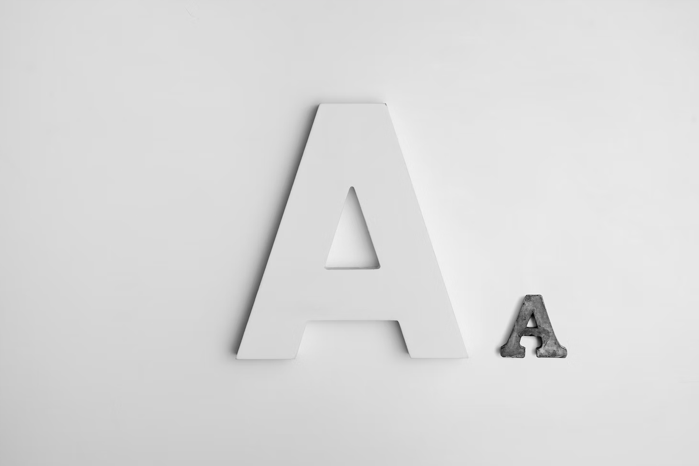
Readability is the impression of how easy it's to read words, phrases and blocks of text. On the other hand, legibility refers to how clear it's to distinguish the letterforms when reading.
Scale
A great visual hierarchy is fundamental to help users process the information effortlessly and understand the order and structure of your content.
One way to establish a good visual hierarchy is to use a typographic scale to determine the size of your typographic elements to achieve a smooth reading experience. Choosing the correct scale is also important to tell your story appropriately.
Which scale to use?
A scale includes a range of contrasting sizes based on a ratio to define appropriate sizes for your text elements, such as headings, sub-headings, list and body copy. The scale that you will decide to use will depend on the goal of your design and the feel you want to convey.
Remember, every typeface has different personalities, voices and timbre; choosing an appropriate scale and typeface for your design is your superpower to manipulate the way users will feel when interacting with your interface.
Generally, I always define the sizes of my typographic elements on the Medium-scale "Perfect Fourth 1.333" or "Major Third 1.25" because they include font-sizes that work well for a variety of desktop sites such as blogs, corporate or marketing sites. These scales are suitable for design aiming to feel.
However when I want my design to feel bold or add drama I use Large scales (1.333 or greater) to attract the users’ attention — especially with headlines.
Note that for the mobile screens, you can use a smaller scale to define lower sizes for your text elements.
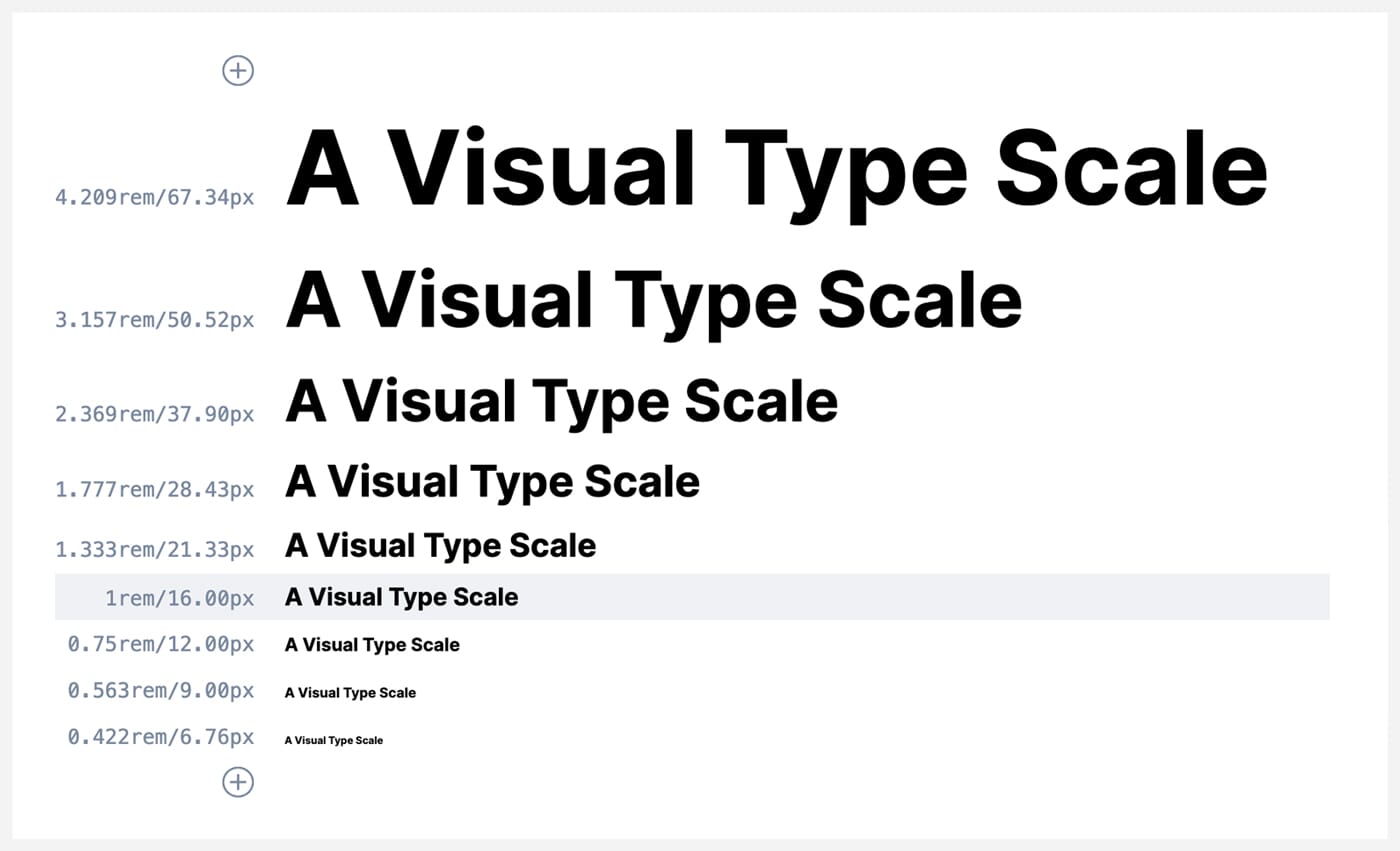
To visualise and pick the types of scales that you could use in your project, I suggest that you use websites like Type Scale or Utopia.
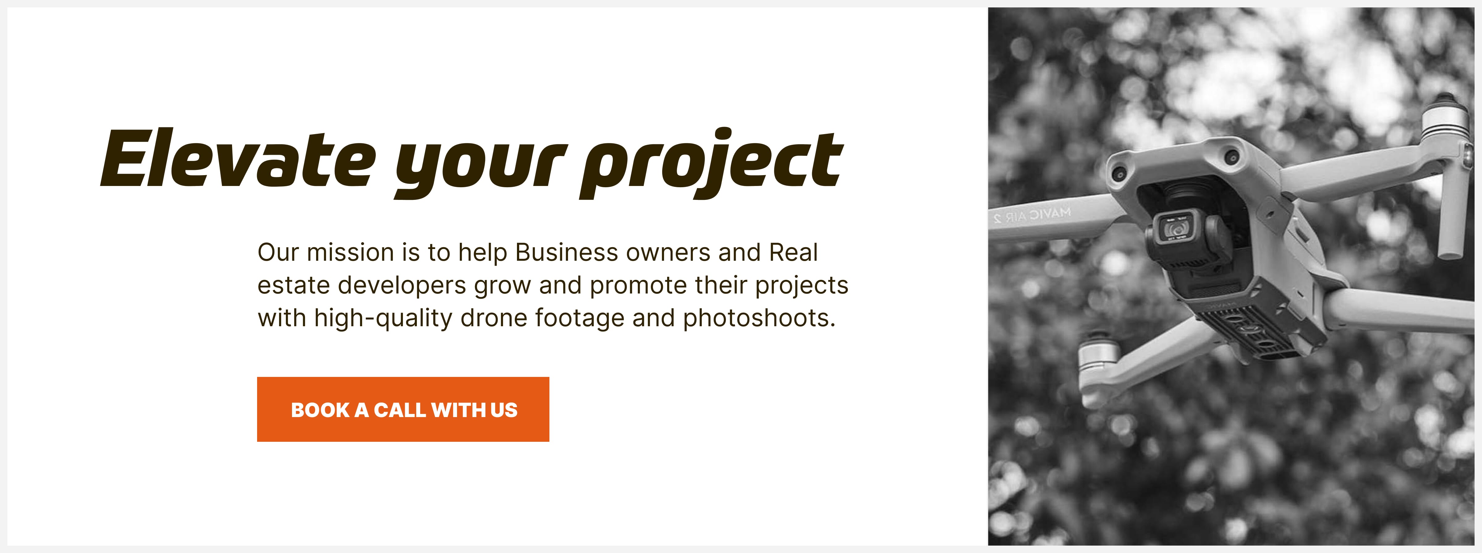
Headlines are meant to be noticed.
Headlines and subheadings demonstrate hierarchy and are perfect to grab your reader’s attention. Headlines are your opportunity to interrupt, seduce and draw people into your content with an expressive typography.
Choose Display typefaces since they strike at large sizes, and are suitable for creating an image that visitors see before they read. On the design below I use the typeface “Prometo”
Another way to be expressive with typefaces is to be creative with your main headlines. For example, you can use a typeface that offers different styles and weights that you can combine from a font-family like “Inter” this will create an appealing graphic image that people will see before they read.
Typesetting
In a nutshell, Typesetting is the arrangement of words in order to create an optimal reading experience — it’s what forms the backbone of the reading experience on a layout.
When you typeset a content type like an article, no matter the language of the content, treat it like a piece of art to achieve a great reading experience for your users:
Below are 7 characteristics to consider to prepare well the text for reading:
Based on the typographic scale, choose appropriate sizes for your typographic elements like headings and paragraphs. Most web interfaces utilise a base font size of (16px or 1rem) as a good starting point for paragraphs and labels, so they are readable and legible.
Font pairing
Pair contrasting fonts/typefaces to mark differences and enhance the visual hierarchy. One easy way to achieve good pairing is to combine a serif with a sans-serif typeface — or to choose fonts/typefaces with similar legibility and readability characteristics.
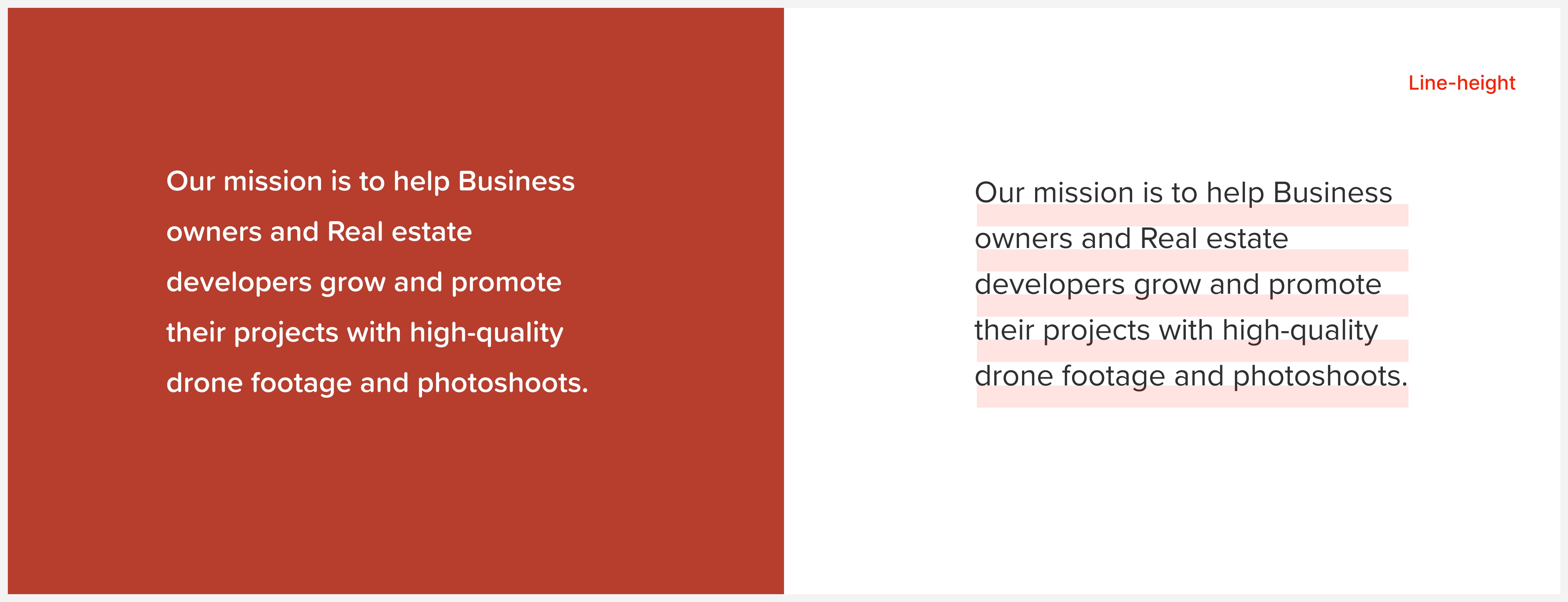
Line-height
Line-height or leading refers to the white-space inserted between lines to give the content a more readable and legible appearance. Adjust the line height until it looks and “feels” right for your design. For example, more space can make your content feel luxurious. But don’t set a line height which is too loose, as it can become harder to read.
You should always increase the amount of leading for reversed designs.
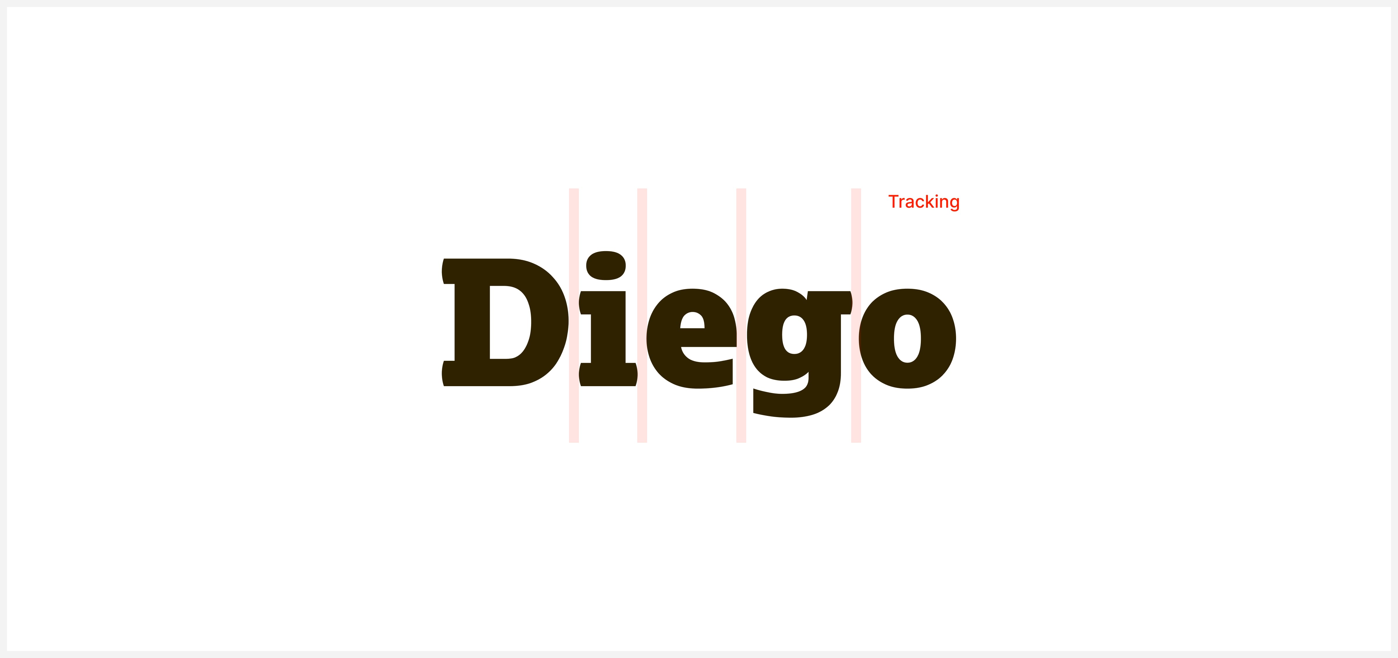
Letter Spacing/Kerning
Refers to the space between letters; play with tracking to give your headlines a special feel. But pay attention to not having a small tracking between characters in paragraphs, as it can make your content look awkward and hard to read.
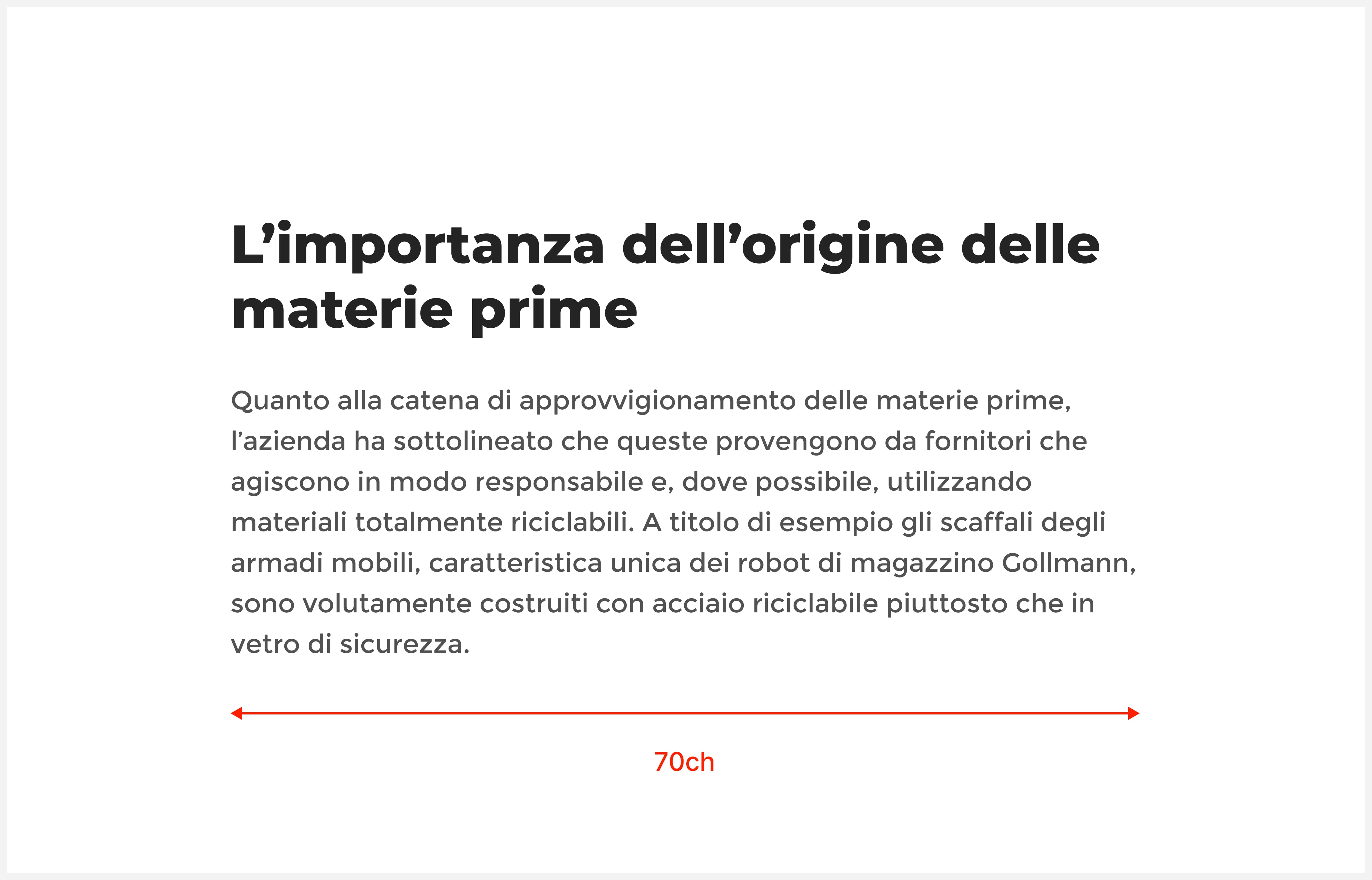
Paragraph size
For long content like articles, define your paragraph length to about 40-70ch; some research shows that you can go up to 100ch max for the paragraph length to ensure a great reading experience.
Paragraphs/standfirst
Adds interest draws the user into your content. Go big in that one as it can also enhance the hierarchy of your content and make your content easier to scan
Drop Caps
Drop Caps are the initial letters at the beginning of a paragraph on a book or journal. Applying this effect on the web gives an original texture and feel to the piece of content. It leads the user’s eyes into where the content stats and gives

Conclusion
Next time you want to create an impact and engage with your users, consider using expressive typography for your headings and typeset your content beautifully to create a comfortable reading experience.
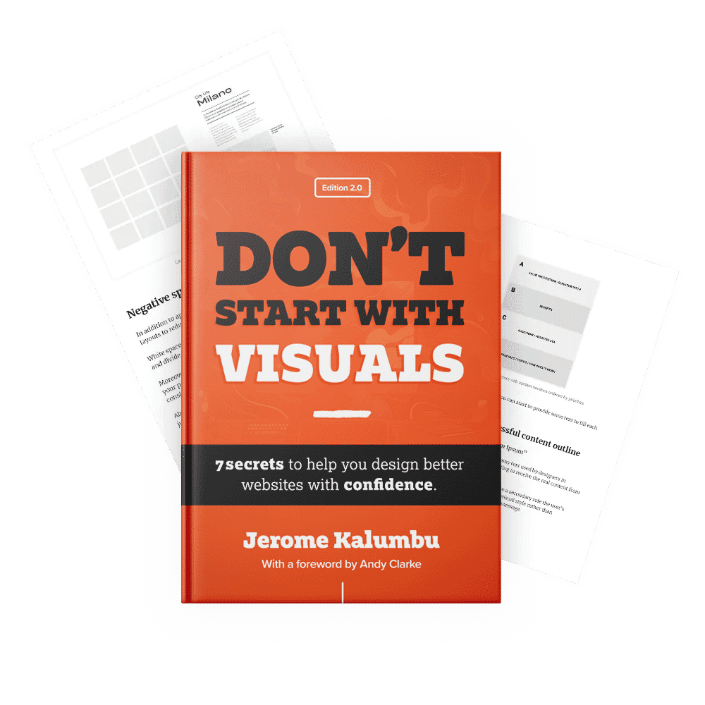
If you want to learn more about this topic, read my book “DON’T START WITH VISUALS”.